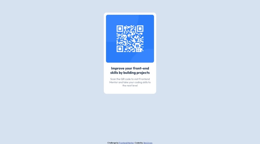
Design comparison
Community feedback
- @NehalSahu8055Posted about 1 year ago
Hello Coder 👋
Congratulations on successfully completing the challenge! 🎉
Few suggestions regarding design.
-
Don't use
paddings or marginsfor centering the card as it will notdynamically centerthe card remove this and use either flex or grid for the same -
To
properly center the card -
USING FLEXBOX on the parent element
body{ display: flex; justify-content: center; align-items: center; min-height: 100vh; ... }-
You are
wrapping main and footerinside adivits unnecessary to do this. -
For
non-decorative imagesgive meaningful and descriptive alt likealt= "QR code to frontend mentor website". -
Use
responsive units(rem, em, %)from next project. Explore respective use cases on google.
I hope you find this helpful.
Happy coding😄
Marked as helpful0@YeniUvwoPosted about 1 year agoI found this very helpful. Thank you for that!
However, i just tried out your suggestion and this made my footer leave the bottom of the page.
@NehalSahu8055
0 -
Please log in to post a comment
Log in with GitHubJoin our Discord community
Join thousands of Frontend Mentor community members taking the challenges, sharing resources, helping each other, and chatting about all things front-end!
Join our Discord
