Design comparison
Solution retrospective
Would welcome any feedback on how to improve the outcome, or just to improve the coding.
Community feedback
- @palgrammingPosted over 3 years ago
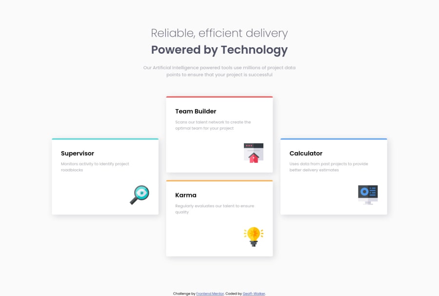
Looks good if you wanted to make it a little better you might make a middle transition of 2 columns with 2 cards in it to make better use of the space before the desktop layout
Here is someone challenge from not to many days ago that I thought made really good use of space for all screen sizes https://www.frontendmentor.io/solutions/fourcard-feature-with-a-cool-animation-sasssmacss-xYLyDShvs
0@Geoff-WalkerPosted over 3 years ago@palgramming
Thanks for the advice Patrick I've only been coding a couple of months the help is massively appreciated!
I have made some responsive changes, going to a two column layout as you suggested and also fixed the not so great look on the Samsung fold.
Thanks again Geoff
0
Please log in to post a comment
Log in with GitHubJoin our Discord community
Join thousands of Frontend Mentor community members taking the challenges, sharing resources, helping each other, and chatting about all things front-end!
Join our Discord
