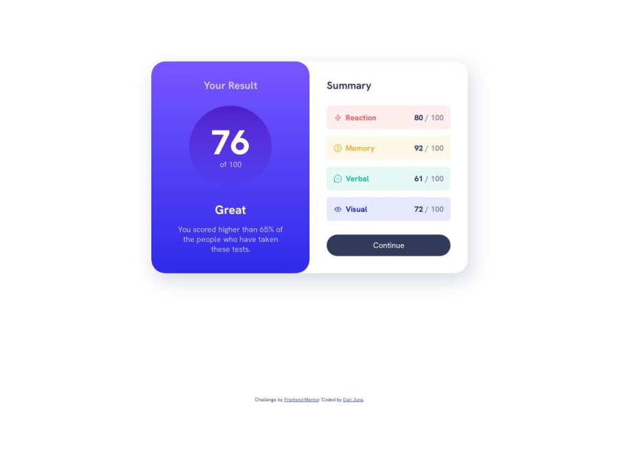
Responsive Layout for Results Summary Component with CSS variables.
Design comparison
Solution retrospective
I stripped out the stroke for the svg files and re-populated it with CSS variables and data-types to allow easy changing of the colors for those summary items in the future. You would just need to change the color at one location and it will adjust the background, svg icon, and title of the result all at the same time.
I would attempt to mess with the JSON data and pull the information in from there, but wanted to use the data-type and svg tag for the coloring instead.
What challenges did you encounter, and how did you overcome them?Biggest challenge was remembering the svg stroke replacement and creating those variables to adjust it. I looked back at a previous tutorial I had done with that process to refresh my memory.
What specific areas of your project would you like help with?Nothing in particular, but will always take suggestions and critiques.
Community feedback
Please log in to post a comment
Log in with GitHubJoin our Discord community
Join thousands of Frontend Mentor community members taking the challenges, sharing resources, helping each other, and chatting about all things front-end!
Join our Discord
