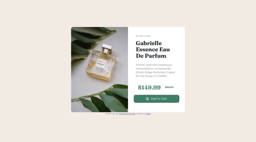


Design comparison

Solution retrospective
This was the first project I have used Picture element, responsive layout changing not just scaling, and starting from mobile size instead of desktop.
What challenges did you encounter, and how did you overcome them?Only thing that gave me issue was trying to have the mobile size both fill vertically while not having excess white space.
Eventually I gave up on having it do so for 100% body height in effort to match the image exactly as that resulted in way to much white space, I am guessing the issue is tied to the size of the mobile layout image coupled with scaling to fit in the small width.
Community feedback
- @BeeAlmightyPosted 4 months ago
Hi Matt, Great work on this project! I love how close to the design your project is. However, i noticed some things i think you could have done better.
- The 'Add to cart button' still has the default border around it. you can get rid of that with
border: noneproperty. Also you can add CSS transitions to the button to make the transition smooth when you hover on the button with atransition: "transition area"(background-color) "transition-time"(0.2s) "transition effect"(ease-in-out). To change the cursor to pointercursor: pointer. - At some point, your image was not responsive with respect. I think was approach was good but it suggest using the display property to hide and display the image when the appropriate image comes on.
- I noticed you hardcoded the PERFUME text to add spaces between letters. A better approach would have been
letter spacing: 0.5rem
Overall, great work Matt!
0 - The 'Add to cart button' still has the default border around it. you can get rid of that with

Please log in to post a comment
Log in with GitHub
Join our Discord community
Join thousands of Frontend Mentor community members taking the challenges, sharing resources, helping each other, and chatting about all things front-end!
Join our Discord