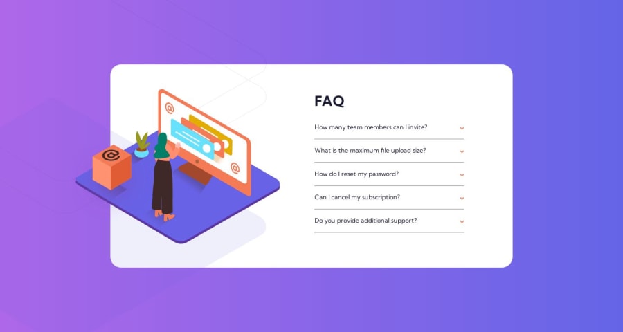
Design comparison
Solution retrospective
It was really interesting to make my own "summary" instead of using the classic HTML
<details>
    <summary>Title</summary>
    <p>Content</p>
</details>
I guess it was difficult to work with those imagens on top of another, and the BG ended up overflowing the Card component. The only way I think of making the BG work as expected, is to make another app, without using the Card component as a displayer to other components. Any ideas?
Community feedback
- @brunomoletaPosted about 1 year ago
Hey Koliak, I'm testing your app in the mobile width, and the illustration can't be seen. You may correct it with a
margin-block: 8remor so.About your questions, I believe that in a "real life" project, perhaps those two top "rings" should be given to the developer in the same
svgof the desktop image, as... they only appear along with it. I wouldn't worry about that.I see that you saw it as a valuable idea not to use the
detailstag. I would stick to the native tag, as thediv's you used carries no semantic value.However, you can compensate the semantical gap with region: role. Check it out, as you may find a good use for it.
You will probably need some
ARIAas they, according to MDN:ARIA roles provide semantic meaning to content, allowing screen readers and other tools to present and support interaction with an object in a way that is consistent with user expectations of that type of object. ARIA role is to describe elements that don't natively exist in HTML or exist but don't yet have full browser support.I would also consider making the accordion open only one question at a time, as the way it is set, the illustration slides downward, and it's perhaps not the best user experience. It was not a requirement of the challenge, but it is a nice feature.
Keep the hustle :)
Best regards from Brasil 🇧🇷
Marked as helpful0@KoliaKPosted about 1 year ago@brunomoleta I appreciate the feedback. I'll have a look on those details! Also, I spent a whole day trying to code the accordion functionality related to "only one opened at a time" or, "every opened accordion closes whenever the user clicks some accordion". It was hard, and beyond my current level of knowledge.
Ended up making a generic accordion component that receives props while the parent component renders 5 accordions. Because, otherwise, the way I made it before, every accordion would open/close at the same time when clicked. At least, the way I did worked as expected without a ton of conditional statements, even if the final result wasn't the way I intended at first. How do you usually manage those kind of "states"? E.g. you have 3 components that when clicked, go active, when one is active, the other ones will be inactive at the same time.
0@brunomoletaPosted about 1 year ago@KoliaK first I put all the
useStatein a Context to make the overall code organized.In this project I used
const [active, setActive] = useState([ ]);that manages the clickedsummary. When the user clicks on one of them, thestatebecomes the id of the selected item. But if there's one item in the active state, it cleans the state and changes to the new ID.The code mentioned managed the
boldtext, but what made one open while the other closed in the code I did was just:<details open={ () => null} >And it is not perfect 'cause if you click on the same
summarythat is open, it won't close... but I called it a day anyway.Check out the
accordeonContext.jsxin my code, as I commented things written there.Marked as helpful0
Please log in to post a comment
Log in with GitHubJoin our Discord community
Join thousands of Frontend Mentor community members taking the challenges, sharing resources, helping each other, and chatting about all things front-end!
Join our Discord
