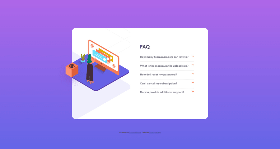
Responsive layout done with detail and summary semantic elements
Design comparison
Solution retrospective
I wanted to get some feedback about how to work with multiple background images in containers. I had to use some negative values and wanted to see if there was another way to best approach projects like this one that requires multiple background images.
Community feedback
- @abhineetkandelePosted over 3 years ago
Nicely done!!
I would definitely recommend checking out the accessibility issues in the report.
Marked as helpful0@oinsurPosted over 3 years ago@abhineetkandele Thank you for your suggestion! I had not noticed the error reports before or in other challenge courses I had done previously. That is a very helpful tool that Frontend Mentor provides for us.
0 - @ApplePieGiraffePosted over 3 years ago
Greetings, Omar Insurriaga! 👋
Well done on this challenge! 👍 Your positioning of the images in this challenge seems pretty good! 😀
I'd like to suggest not using a percentage value for positioning the floating box in the desktop layout of the page, since that means when the height of the accordion card grows (and it will when the FAQs inside it are opened), the position of the cube will shift and it will no longer be in its correct place. A fixed value for
bottom
for the floating cube might work better in this case. 😉Here's my solution to this challenge (which isn't perfect, but not bad, I think 😅) if you'd like to see another approach to positioning the images in this challenge.
Also, you don't need to put
p
tags inside yoursummary
tags (since thesummary
tag should suffice and including ap
tag is producing some errors on the solution report).Hope that is helpful. 🙂
Keep coding (and happy coding, too)! 😁
Marked as helpful0@oinsurPosted over 3 years ago@ApplePieGiraffe Thank you for your suggestion for using fixed values, I will look into that. I had not noticed the error reports before or in other challenge courses I had done previously. That is a very helpful tool that Frontend Mentor provides for us. I really like the animation you have on your floating box!
1@ApplePieGiraffePosted over 3 years ago@oinsur
Haha, thanks! 😀 Glad to help! 👍
0
Please log in to post a comment
Log in with GitHubJoin our Discord community
Join thousands of Frontend Mentor community members taking the challenges, sharing resources, helping each other, and chatting about all things front-end!
Join our Discord