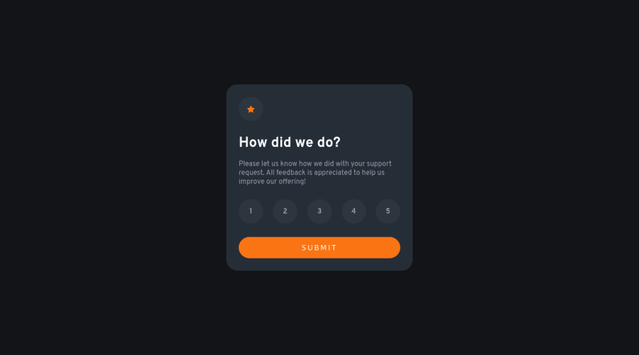
Design comparison
Solution retrospective
Am I using best practices manipulating with DOM? Should I use media-queries this way or is there any better solution for pesponsive layouts?
Community feedback
- @VCaramesPosted almost 2 years ago
Hey there! 👋 Here are some suggestions to help improve your code:
- To not only improve your HTML code but to identify the main content of you page, you will want to wrap your entire component inside the
main
element.
More Info:📚
- The “icons/illustrations” in this component serve no other purpose than to be decorative; They add no value. There
alt tag
should be left blank and have anaria-hidden=“true”
to hide them from assistive technology.
More Info:📚
https://www.w3.org/WAI/tutorials/images/
- The proper way to build this challenge is to create a
form
and inside of it, the “rating buttons” should be built using aninput radio
(wrap all of them inside afieldset
), since this will prevent additional buttons from being active at the same time, and it should have alabel
element attached to it for accessibility.
More Info:📚
MDN <fieldset>: The Field Set element
If you have any questions or need further clarification, feel free to reach out to me.
Happy Coding!🎄🎁
Marked as helpful1@darrowvPosted almost 2 years ago@vcarames thank you for very usefull feedback. Used all your advices to improve my work. All of that makes perfect sense.
0@VCaramesPosted almost 2 years ago@darrowv
I am glad that I was able to help out!
Keep it up!
1 - To not only improve your HTML code but to identify the main content of you page, you will want to wrap your entire component inside the
- @iamzaidmohammedPosted almost 2 years ago
Hey! You did a great work. I really love your work. Keep it up.
Happy coding.🎉
1
Please log in to post a comment
Log in with GitHubJoin our Discord community
Join thousands of Frontend Mentor community members taking the challenges, sharing resources, helping each other, and chatting about all things front-end!
Join our Discord