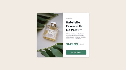
Not Found
Not Found
Not Found
Not Found
Not Found
Not Found
Not Found
Not Found
Not Found
Not Found
Not Found
Not Found
Not Found
Not Found
Not Found
Not Found
Not Found
Not Found
Not Found
Not Found

Submitted

Responsive layout using css variables and flex-box

@wagnnermorais

Desktop design screenshot for the Product preview card component coding challenge

This is a solution for...

  • HTML
  • CSS
1newbie
View challenge

Design comparison


SolutionDesign

Solution retrospective


fell free to give some feedback

Community feedback

@CpalmerD20

Posted

Overall the desktop (wide viewport) looks good. The main feedback I could give is that the mobile display isn't as accurate to the design spec as it could be.

For mobile: depending on the width "parfum" is on the same or different lines. While in the design spec "Eau De Parfum" is entirely on a second line. This could be accomplished by specifying a width on .main-title in the media query and adjusting the font-size.

It would be good to revisit and come back to this.

Marked as helpful

0

Please log in to post a comment

Log in with GitHub
Discord logo

Join our Discord community

Join thousands of Frontend Mentor community members taking the challenges, sharing resources, helping each other, and chatting about all things front-end!

Join our Discord