Submitted 8 months ago
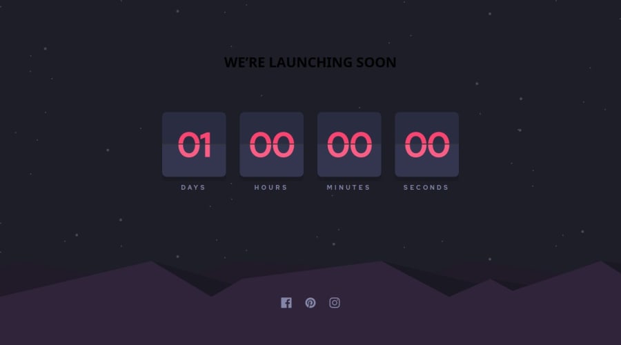
responsive launchdown timer with flip animation
#sass/scss
P
@ScarAgathor
Design comparison
SolutionDesign
Solution retrospective
What are you most proud of, and what would you do differently next time?
I am really proud of the flip animation, making the two boxes align was a hassle but it was worth it. I also used this project to practice using a unch of new js tricks like object entries and generally a lot of object related things.
What challenges did you encounter, and how did you overcome them?Making the two boxes align for the flip animation and making the flip happen in js. I played with the padding and also learnt some new event listeners that helped me solve that part of the code
Community feedback
Please log in to post a comment
Log in with GitHubJoin our Discord community
Join thousands of Frontend Mentor community members taking the challenges, sharing resources, helping each other, and chatting about all things front-end!
Join our Discord
