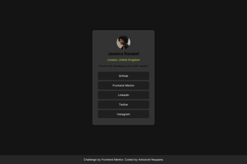
responsive landing using display flex and @media query

Solution retrospective
In this project, I’m most proud of the responsive design implementation and the overall structure that allows the content to adapt smoothly across different screen sizes. The use of media queries ensures that the user experience remains consistent and aesthetically pleasing on desktops, tablets, and mobile devices. The attention to detail in styling, such as the use of hover effects and font choices, adds to the visual appeal and interactivity of the design.
If I were to approach this project again, I might experiment with more advanced CSS techniques, such as CSS Grid, to manage layout complexities and provide even greater flexibility. Additionally, I would consider optimizing the design further by incorporating accessibility best practices, such as improved contrast ratios and keyboard navigation support, to make the site more inclusive for all users.
What challenges did you encounter, and how did you overcome them?One of the challenges I encountered during this project was ensuring that the layout and design elements were responsive across a variety of screen sizes and devices. Balancing the design to look good on both large screens and smaller mobile devices required careful consideration of media queries and adjustments to elements like font sizes, padding, and margins.
To overcome this, I used a mobile-first approach, where the design is initially created for smaller screens and then progressively enhanced for larger screens. This strategy made it easier to adapt the design by adding necessary adjustments rather than having to strip down features for mobile. Additionally, testing the design across different devices and screen resolutions helped identify areas that needed refinement, ensuring a consistent and user-friendly experience across all platforms.
What specific areas of your project would you like help with?I would like help with:
Enhanced Responsiveness: Fine-tuning the responsive design to ensure that all elements scale correctly across a wider range of devices, including very small screens. This includes ensuring that images, text, and layout components are appropriately sized and spaced.
Accessibility Improvements: Incorporating accessibility best practices to make sure the project is usable by people with various disabilities. This could involve improving color contrast, adding ARIA roles, and ensuring keyboard navigation works smoothly.
Performance Optimization: Suggestions on how to optimize the loading times and performance of the site, especially with regard to font loading, image sizes, and overall CSS efficiency.
Advanced CSS Techniques: Exploring advanced CSS techniques like CSS Grid or custom properties (variables) to see if they can simplify or enhance the design and layout.
Cross-Browser Compatibility: Ensuring that the site works consistently across different web browsers and versions, and addressing any potential issues or discrepancies that may arise.
Please log in to post a comment
Log in with GitHubCommunity feedback
No feedback yet. Be the first to give feedback on Ashutosh-Neupane's solution.
Join our Discord community
Join thousands of Frontend Mentor community members taking the challenges, sharing resources, helping each other, and chatting about all things front-end!
Join our Discord