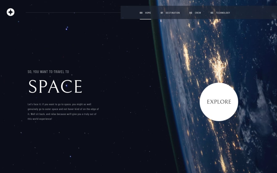
Design comparison
SolutionDesign
Solution retrospective
This one was amazing to work on, would like to know what you think
Community feedback
- @AdrianoEscarabotePosted about 2 years ago
Hi Emmanuel, how are you?
I really liked the result of your project, but I have some tips that I think you will enjoy:
- To improve the accessibility of the project you could have put an h1. Every page must contain a level 1 header, for people who use screen readers, identity what the main title is.
- every Html document must contain the main tag, so we can identify the main content, to fix this, wrap all the content with the main tag. HTML5 landmark elements are used to improve navigation experience on your site for users of assistive technology.
The rest is great!
I hope it helps... 👍
1@otizgitPosted about 2 years ago@AdrianoEscarabote oh yes thanks man, really appreciate the feedback, i'll fix that
1
Please log in to post a comment
Log in with GitHubJoin our Discord community
Join thousands of Frontend Mentor community members taking the challenges, sharing resources, helping each other, and chatting about all things front-end!
Join our Discord