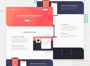
Design comparison
Solution retrospective
Any suggestions or feedback is welcomed!
Community feedback
- @simonhernandezPosted over 2 years ago
Hello, Aranxa!
Nice work on this solution. I really like the fact you are using semantic HTML, BEM and your CSS is very clean!
I have some minor suggestions you might find useful:
-
I would consider setting a
max-widthon the Intro-section's content-container, so that it does not overlap the image on higher screen sizes (I noticed it because my display is 1920x1080). -
In the media query, I would set the
text-alignproperty to initial on the Intro section h3's, State section h2, and Features section h3's, so that they align to the left as in the design. -
As a minor improvement, consider adding focus styles to the interactive elements on the page.
Hope you find this feedback helpful and keep up the good work!
Marked as helpful0@AranxaMoPosted over 2 years ago@simonhernandez Thanks for all the suggestions. I will be working on them :)
1 -
Please log in to post a comment
Log in with GitHubJoin our Discord community
Join thousands of Frontend Mentor community members taking the challenges, sharing resources, helping each other, and chatting about all things front-end!
Join our Discord
