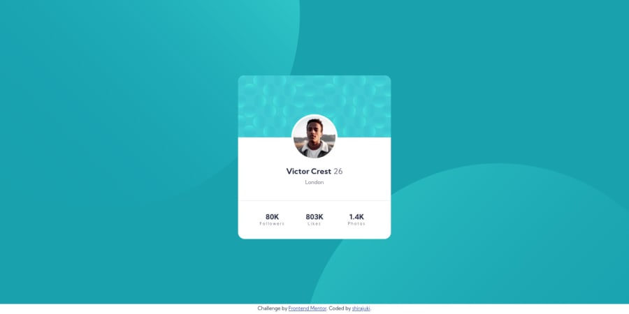
Responsive landing profile card page using Flexbox and Grid
Design comparison
Solution retrospective
Hello! 👋
This is my 2nd solution on Frontend Mentor, and also my 2nd week here! As this was a newbie challenge with no dynamic elements, I chose to build it using static HTML5 and CSS.
I had little time working this week and thus only used about 2 hours on the newbie solution, which means that there is probably still lots to improve code quality-wise. Even though I do believe that I did quite well on this, I still hope for some feedback from the community! Any feedbacks on my use of "percent" (%) on the opposite side for the background-circles as well as the CSS syntax, since i tend to write lots of redundant code for styles, are greatly appreciated!
This time, I used Figma for measuring which has made it a lot easier to get the measurement right even though the monitor on my laptop is smaller than 1440px. All in all I've had a good time relaxing while working on this solution and enjoyed it very much.
I'll be back for another challenge next week, see you all there!
- Shirajuki
Community feedback
Please log in to post a comment
Log in with GitHubJoin our Discord community
Join thousands of Frontend Mentor community members taking the challenges, sharing resources, helping each other, and chatting about all things front-end!
Join our Discord
