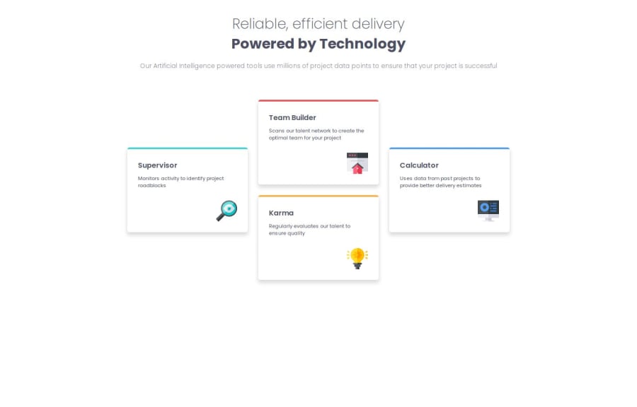


Design comparison

Solution retrospective
It was difficult to correctly set responsivity on all screen sizes. I am proud of way that I have used grid, I think that it was used correctly Next time I am going to focus on bigger screens, content should flex and fit to screen automatically
What challenges did you encounter, and how did you overcome them?I wasn't aware that I can use flex for one part of page and grid for another, learned from another users projects Also I wasn't sure the way that boxes should looks like while shrinking, added extra media query and it works fine
What specific areas of your project would you like help with?Definitelly need support with bigger screens responsivity, have no clue how should I write my code to make it fits automatically to the screen size Please take an overall look on my job and check site with various screen sizes to confirm that it behaves correctly

Join our Discord community
Join thousands of Frontend Mentor community members taking the challenges, sharing resources, helping each other, and chatting about all things front-end!
Join our Discord