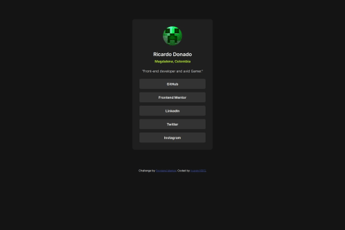
Design comparison
Solution retrospective
not sure in this project, probably the hover effect i added
What challenges did you encounter, and how did you overcome them?i didnt encounter any big challenge
What specific areas of your project would you like help with?i don't know why but when I try the page on my computer it looks perfect, but when I try on my phone some texts inside the buttons aren't centered for some reason, i even tried changing the centering method but it didn't worked
Community feedback
- @manav-sharma69Posted 6 months ago
Hi! I looked at your code and found out that you're using
align-content: center;
property on the anchor tags.However, this might not be working because, as MDN says, 'This property has no effect on single line flex containers (i.e. ones with flex-wrap: nowrap)'.
And the default of
flex-wrap
isnowrap
.Your problem should be solved if you used
align-items: center;
on<li>
element. Also, there's thealign-self
property which can be used in place ofalign-content
, but I don't really use it and it doesn't always work (read the docs).Relevant MDN links:
- align-content (The line just below Try it Section)
- flex-wrap - See the values section
- align-items
- align-self
Hope this helps!
Marked as helpful1@ricardo1003Posted 6 months ago@manav-sharma69 Thank you! I will definitely try this and fix it so i reupload it
1@ricardo1003Posted 6 months ago@manav-sharma69 I tried your solution but it didn't worked, then I had the idea of using padding and well, it worked
0@manav-sharma69Posted 6 months agoHi @ricardo1003!
After I read your comment, I was compelled to check the code because I thought my solution would work!
First of all, you've removed the flex box completely and created a responsive component without using the "responsive" layout tools (grids or flexboxes). That's a different approach to responsive design in which you let the browser do the calculations. Personally, I like this approach as it keeps your CSS small.
For the failed solution: I looked at your CSS file's history and saw that you added
align-content: center;
to theli
element. Here's the link. But I suggested to usealign-items
, notalign-content
.You may try to see if it works:
- by making the
<li>
elements flex-box, and - centering their child elements by adding the properties
align-items: center
andjustify-content: center
.
But your solution also works! And there are different ways of achieving the same solution. Yours is different and in my opinion, better!
1@ricardo1003Posted 6 months ago@manav-sharma69 I see what you mean, I tested everything on my computer before doing an actual commit, that's why you see that one instead of the one you suggested me. Anyways, I just tried again and found that it actually works, but only when the link doesn't have any height, but that wouldn't be convenient since I want the button to cover all of the container. I tried adding little heights and found out that the link is technically centered, but the text isn't, so that is why it didn't worked(i had he height to 100%)
1@manav-sharma69Posted 6 months ago@ricardo1003 So height was creating problems. I don't tweak heights in my designs so I couldn't guess that it was causing the problem.
1 - @ahmedyasserdevPosted 6 months ago
hey Ricardo , i see that you made a great job , keep going 🔥
1
Please log in to post a comment
Log in with GitHubJoin our Discord community
Join thousands of Frontend Mentor community members taking the challenges, sharing resources, helping each other, and chatting about all things front-end!
Join our Discord