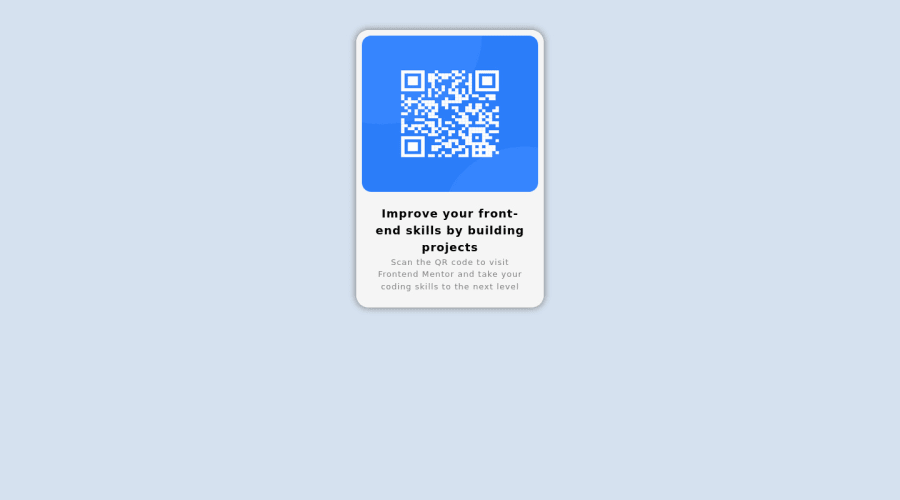
Design comparison
Community feedback
- @correlucasPosted over 2 years ago
👾Hi @AM-png, congratulations on your solution!👋 Welcome to the Frontend Mentor Coding Community!
Great solution and a great start! From what I saw you’re on the right track. I’ve few suggestions for you that you can consider adding to your code:
1.Fix the alignment of the whole content using
flexandmin-heightto manage the vertical alignment and make everything centered.First of all putmin-height: 100vhto thebodyto make the body display 100% of the viewport height (this makes the container align to the height size that's now 100% of the screen height) size anddisplay: flexeflex-direction: columnto align the child element (the container) vertically using the body as reference.body { min-height: 100vh; background: #d5e1ef; display: flex; align-items: center; justify-content: center; }2.Use relative units like
rem or eminstead ofpxto have a better performance when your page content resizes on different screens and devices.REMandEMdoes not just apply to font size, but all sizes as well. To save your time you can code your whole page usingpxand then in the end use a VsCode plugin calledpx to remto do the automatic conversion or use this website https://pixelsconverter.com/px-to-rem3.Something that can be a time saver for you is to use a CSS RESET to remove all default settings for margins, making the images easier to work, see the article below where you can copy and paste this CSS code cheatsheet: https://piccalil.li/blog/a-modern-css-reset/
Here's my solution for this challenge if you wants to see how I build it: https://www.frontendmentor.io/solutions/qr-code-component-vanilla-cs-js-darklight-mode-nS2aOYYsJR
✌️ I hope this helps you and happy coding!
Marked as helpful0 - Account deleted
Hey , some suggestions to improve you code:
- To center you content to your page, add the following to your Body Element:
body { min-height: 100vh; display: grid; place-content: center; }-
The Alt Tag description for the QR image needs to be improved upon. Its needs to tell screen reader users what it is and where it will take them to when they scan it.
-
Change the
widthtomax-widthin your .card to make it responsive. -
Delete the
heightfrom the img, not needed.
Happy Coding!
Marked as helpful0 - @Chermann-KINGPosted over 2 years ago
Hey @AM-png, some suggestions to improve you code:
If you notice, it is a card displaying a QR code. The
<aside>tag that you use here to enclose each element of the map (texts and image) is not recommended for this purpose. You could have used a simple<div>or even an<article>. All the same congratulations for the work done.I leave you the link that can show you the good use of <aside> and <article> tags
Marked as helpful0@AM-pngPosted over 2 years ago@Chermann-KING I removed the aside tag as It was unnecessary. After reading the article you posted, I ended up enclosing the whole card with the <article> tag as the card is indeed an independent, self-contained content. That was helpful, thanks!
1
Please log in to post a comment
Log in with GitHubJoin our Discord community
Join thousands of Frontend Mentor community members taking the challenges, sharing resources, helping each other, and chatting about all things front-end!
Join our Discord
