Submitted almost 3 years ago
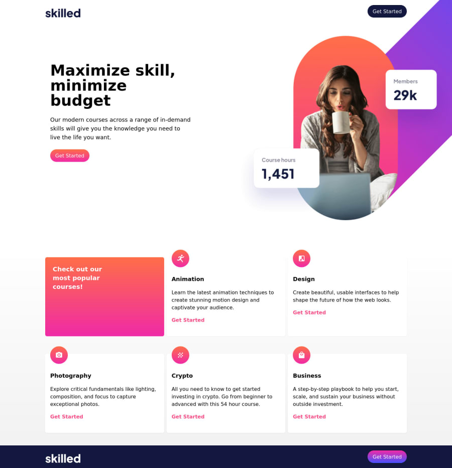
Responsive landing page with TailwindCSS
#tailwind-css
@binthroot
Design comparison
SolutionDesign
Solution retrospective
Built with tailwindcss. Mobile first. The mobile and tablet screens look fine but desktop could use revision. Would love to hear from anyone who was more successful so I can revise.
Community feedback
- P@nikoescobalPosted almost 3 years ago
Hello there! 👋
Congratulations on finishing your challenge! 🎉 Feel free to check out my project here, and the source code here
Here's some other feedback on this solution:
- You can add min-height to the tables for each breakpoint. It looks quite small on desktop
- Your buttons lack padding, as they're considerably smaller compared to the original design
- You could do with increasing the grid gap for desktop
- It seems like you didn't apply the correct letter spacing, font colors, and padding for the 1200px breakpoint
- Check the report to fix accessibility issues - you currently have 1 listed
I hope this is helpful and all the best with your coding journey!
Marked as helpful0
Please log in to post a comment
Log in with GitHubJoin our Discord community
Join thousands of Frontend Mentor community members taking the challenges, sharing resources, helping each other, and chatting about all things front-end!
Join our Discord
