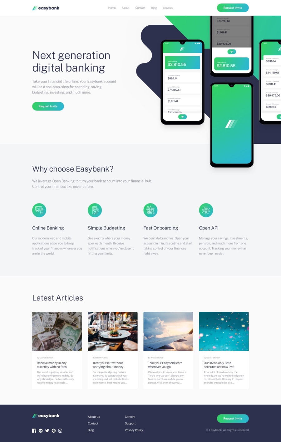
Design comparison
SolutionDesign
Solution retrospective
Bulk of the work was in the Hero Section and it was good for practice
Community feedback
- @jamesekunolaPosted over 1 year ago
There is a horizontal overflow issue in your UI, and it seems that you might have forgotten to set a maximum width for your UI. Please address these concerns, particularly when the user's screen size exceeds 90rem. Apart from these points, your user interface is fantastic.
Marked as helpful1@elvissamuelPosted over 1 year agoThanks, it was a mistake, I didn't even take note of it@jamesekunola
0
Please log in to post a comment
Log in with GitHubJoin our Discord community
Join thousands of Frontend Mentor community members taking the challenges, sharing resources, helping each other, and chatting about all things front-end!
Join our Discord
