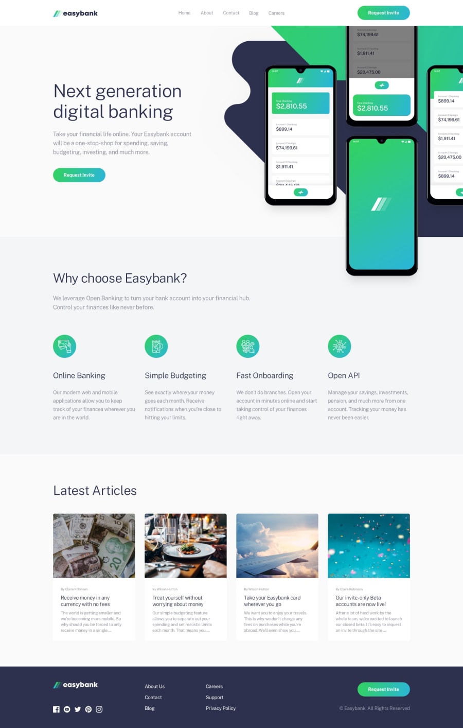
Responsive landing page with React and Tailwind CSS
Design comparison
Solution retrospective
Got additional knowledge working with positioning, flexbox and grid layouts.
Responsive design can be tough when dealing with positioning and would love to tackle more tasks with these features.
What challenges did you encounter, and how did you overcome them?One of the challenges I encountered was dealing with the hero section images in the header.
Mobile and laptop design wasn't a problem but things got dirty when in mobile-landscape mode.
I spent a significant amount of time on this part and ended up with a preferred result.
What specific areas of your project would you like help with?I would like to get help with cases like the hero section images, where images can float over other sections (like it is positioned absolutely) and still get hidden in another part of it, changing layout as the screen gets wider.
Community feedback
Please log in to post a comment
Log in with GitHubJoin our Discord community
Join thousands of Frontend Mentor community members taking the challenges, sharing resources, helping each other, and chatting about all things front-end!
Join our Discord
