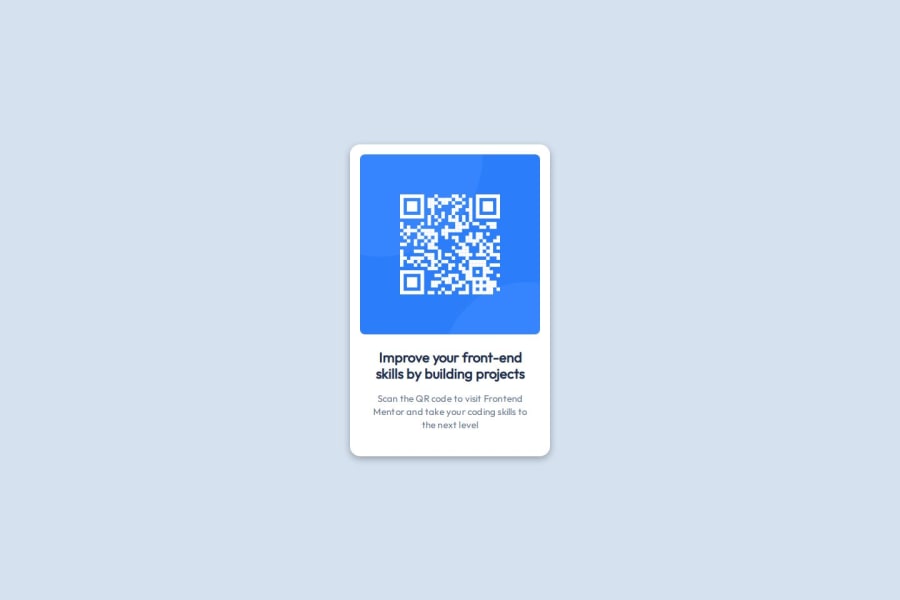
Responsive landing page with QR Code to Frontend Mentor with HTML, CSS
Design comparison
Solution retrospective
I’m proud of completing this challenge and creating a functional QR code component.
What challenges did you encounter, and how did you overcome them?Some Tailwind CSS classes, like text-slate-900, didn’t work, so I used custom CSS instead.
What specific areas of your project would you like help with?I would like feedback on optimizing my code and ensuring it is clear and maintainable.
Community feedback
- @MattUnderscoreZhangPosted 5 months ago
Your code looks great! I like the use of both traditional CSS and Tailwind. I just started front-end coding, so I didn't know you could combine the two of them.
I noticed that I used "min-h-height" for the background element, while you used "h-height". This probably doesn't matter for this case though.
Also, I don't understand how your QR code is staying in the center of the screen, as opposed to in the upper-left corner. I had to do "<div class="flex flex-col items-center justify-center min-h-screen bg-slate-300">" to get it to center.
0
Please log in to post a comment
Log in with GitHubJoin our Discord community
Join thousands of Frontend Mentor community members taking the challenges, sharing resources, helping each other, and chatting about all things front-end!
Join our Discord

