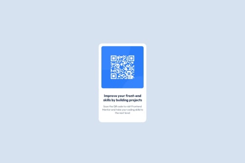
Responsive landing page with QR Code

Solution retrospective
Definitely most proud of figuring out how to use flexbox and grid together to format everything the way I needed it (proper spacing and margins). I think next time I'd more thoroughly investigate efficient ways to solve a problem like this. I spent too much time trying to figure out how to code this without using a flexbox and grid.
What challenges did you encounter, and how did you overcome them?Biggest challenge had to have been justifying/aligning the content properly. I didn't have a ton of knowledge beyond base HTML/CSS, and it turned out to be way easier than I thought! I originally tried just experimenting with functions I was familiar with, but then ended up looking on Google for resources I could use to show me how to properly utilize a flexbox to position the elements the way I wanted them.
What specific areas of your project would you like help with?I think efficiency of my code is the biggest one. For example, I think my CSS Stylesheet is very oversaturated, and was wondering if there were changes that could be made to my HTML and CSS files to make it less overwhelming but still have the same effect as I have now.
Please log in to post a comment
Log in with GitHubCommunity feedback
No feedback yet. Be the first to give feedback on Lilian Huang's solution.
Join our Discord community
Join thousands of Frontend Mentor community members taking the challenges, sharing resources, helping each other, and chatting about all things front-end!
Join our Discord