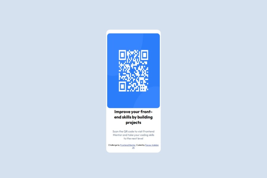


Design comparison
SolutionDesign

Community feedback
- @doganayurgupluogluPosted 20 days ago
Semantic HTML
Your HTML structure is quite simple and well-organized. However, making some improvements to enhance its semantic meaning would be beneficial.
- The entire content should be wrapped inside a
<main>tag to properly define the main content of the page. - Instead of using a
<div>with the class.divFirst, consider using a more meaningful tag like<section>.
Example:
<main>
  <section class="qr-card">
    <!-- Content -->
  </section>
</main>
Code Structure & Readability
- Repeated
font-familydeclarations can be defined once inside thebodyselector. - Instead of using inline styles in
<h2>and<p>, move all styles to thestyle.cssfile. - The
font-weight: 700px;declaration is incorrect. The correct syntax is:
font-weight: 700;
Design Consistency
- The overall layout looks similar to the original design, but there are spacing and alignment inconsistencies.
- The QR code is too close to the edges of the
.divFirstcontainer. Adding padding would make it look cleaner.
If you need further guidance, feel free to check my repo:
GitHub RepositoryThis will help you structure your code better and improve its accessibility. Keep up the great work!
1@FavsonPosted 20 days ago@doganayurgupluoglu Thank you so much for that, I will ensure to make the necessary corrections
0 - The entire content should be wrapped inside a

Please log in to post a comment
Log in with GitHubJoin our Discord community
Join thousands of Frontend Mentor community members taking the challenges, sharing resources, helping each other, and chatting about all things front-end!
Join our Discord