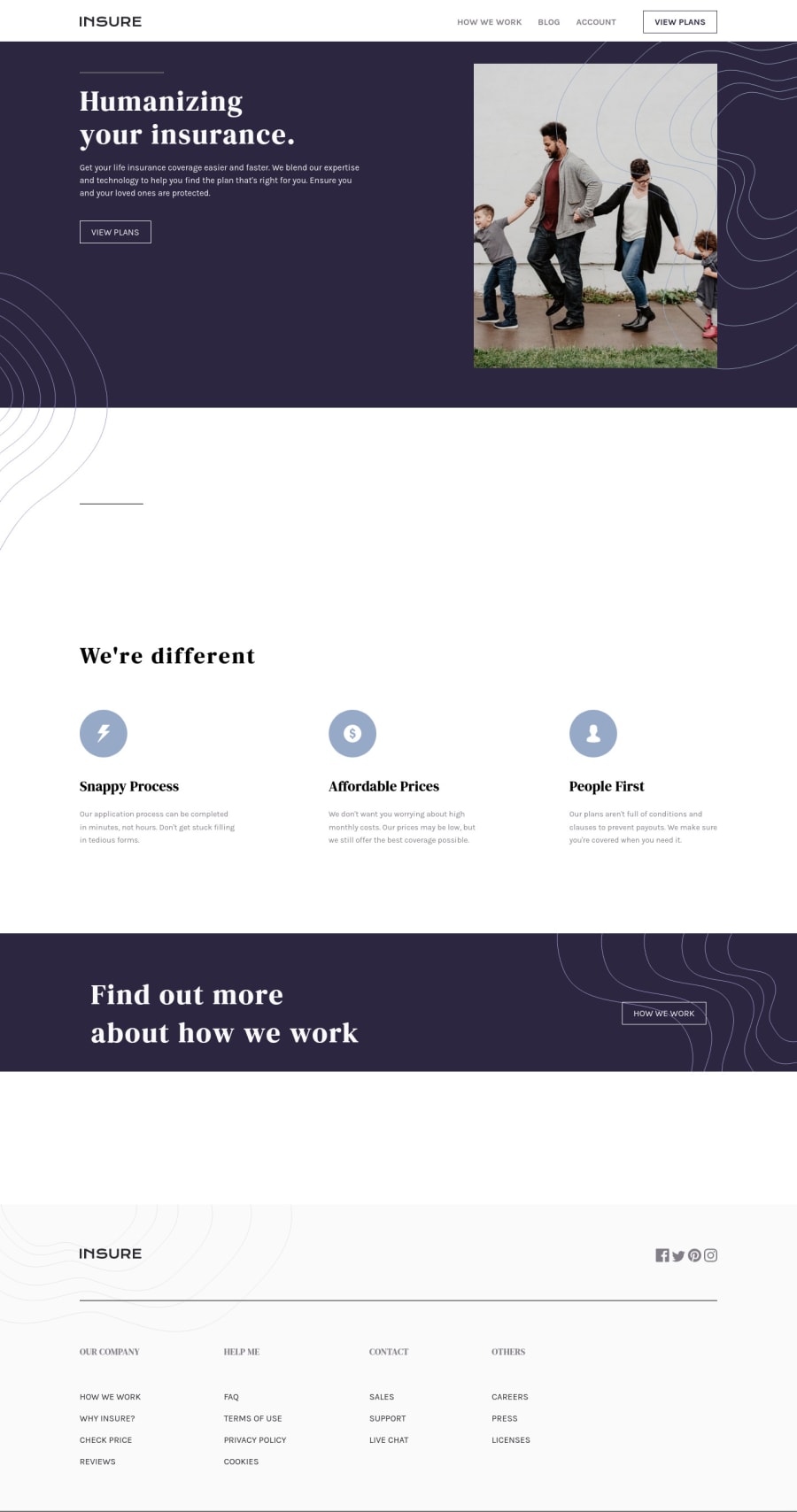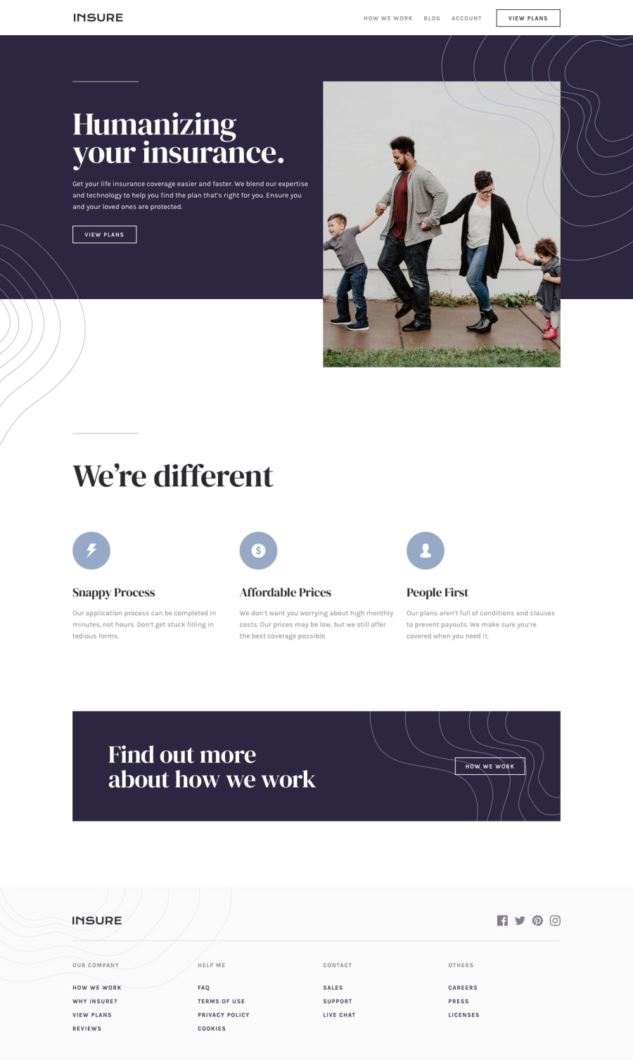
Responsive landing page with html, css using media queries
Design comparison
Solution retrospective
Will Love to have Feedback.
Community feedback
- @gsterczewskiPosted almost 4 years ago
👋 Hi there WebLytic
Good effort, your solution looks good and it's responsive.
I have few tips, I hope they will prove useful.
Currlently there are no
hoverstates on buttons/links and icons except those in the header, so adding them could improve user experience.One of your
aelements havehrefattribute set to btn-2 that leads to 404 on vercel, I think it is a bug, perhaps you meant to useclass?I would be nice if you could consider adding some support for keyboard users, so they can navigate yor site (make buttons and anchors focusable).
Anyway, I think you are going in the right direction, and I hope to see your future projects. 👍
Cheers!
1
Please log in to post a comment
Log in with GitHubJoin our Discord community
Join thousands of Frontend Mentor community members taking the challenges, sharing resources, helping each other, and chatting about all things front-end!
Join our Discord
