Not Found
Not Found
Not Found
Not Found
Not Found
Not Found
Not Found
Not Found
Not Found
Not Found
Not Found
Not Found
Not Found
Not Found
Not Found
Not Found
Not Found
Not Found
Not Found
Not Found

Submitted

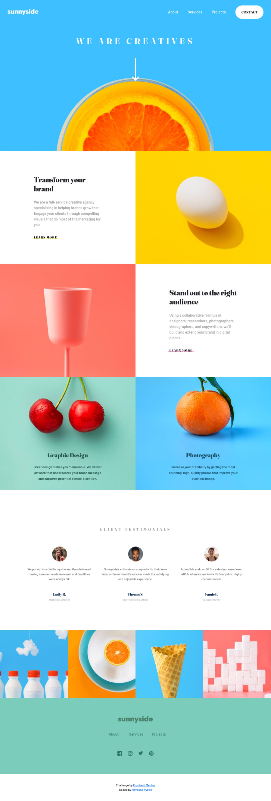
Responsive landing page with HTML and CSS using Bootstrap

HaYeongβ€’ 100

@hypyeon

Desktop design screenshot for the Agency landing page coding challenge

This is a solution for...

  • HTML
  • CSS
  • JS
2junior
View challenge

Design comparison


SolutionDesign

Solution retrospective


  • I couldn't complete the right top (supposed to be a triangle shape) for the topdown menu for the mobile design.
  • Any advice on how to expand padding/margin scales (they only have until 5 i.e. px-5) on HTML would be appreciated.
  • Used all suggested fonts from Style guide, but when font size is set larger the font style is lost (it goes back to default font). The heading (WE ARE CREATIVES) is the example.
  • Other than that it was a fun experience, learned a lot about Bootstrap. I chose this project specifically to practice Bootstrap and to get design ideas with colors. Would love to hear feedbacks from the others! Thanks for reading! :D

Community feedback

Elaineβ€’ 11,400

@elaineleung

Posted

Hi HaYeong, good job completing this website layout! πŸ™‚ I'll try to answer some of your questions:

  1. About the triangle, I used a pseudo element in my solution, like this:

    nav::before {
        content: "";
        margin-left: auto;
        position: relative;
        top: -1.5rem;
        border-width: 0 0 1.5rem 1.5rem;
        border-style: solid;
        border-color: var(--clr-white) transparent;
        display: block;
        width: 0;
      }
    
  2. About the styles being gone when setting a larger font size, are you referring to going from mobile to desktop view and having the styles overwritten? I tried checking out your code to see where the media queries are, but I couldn't find any; I just see that you have a separate mobile and desktop stylesheet. In any case, I think as long as you specify the desktop styles in the media query (or mobile styles if you had a desktop-first approach), then that should be OK.

  3. About paddings and margins, I notice you have a fairly large padding in the hero section! I generally don't suggest using large paddings as that could produce issues at smaller breakpoints. For me, I used responsive width properties instead to keep the content centered with enough space around the text.

Feel free to check out my solution here: https://www.frontendmentor.io/solutions/responsive-landing-page-with-cube-css-zJrpzUIQqd

Marked as helpful

1

HaYeongβ€’ 100

@hypyeon

Posted

@elaineleung Thank you so much for taking your time to review my solution! :) I checked your solution & code, it looks amazing. There are so many issues that appear on the report for my solution, here I was thinking I did a great job and invested a long time on this, after seeing the result I lost about 50% of my confidence, lol. But I am proud that I finished this challenge, even though I had many moments where I wanted to quit. Thanks again for your feedbacks, I hope I get better at it soon. I'm off to review your code & solve a new challenge. Cheers!

1
Elaineβ€’ 11,400

@elaineleung

Posted

@hypyeon Hey HaYeong, no worries, we've all been there, which is why it's important to keep supporting and encouraging one another πŸ™‚. I've made sooo many mistakes before, but these mistakes also help me learn, and every time I see myself improve a bit more, I have a bit more motivation to keep going.

I had a look at your report just now, and a lot of them look like they're issues due to a repeated id, and this is really easy to fix; I'd probably just look for all the id attributes and then delete them and just change the id to a class instead. Basically, id can only appear in one element in your HTML, and if they appear in more than one element, you'd have a problem because the browser wouldn't know which one to pick out if it needs to pick out one. For instance, if you had id="client-position" on an element, you can't use client-position as an id for another element.

Generally when you use an id, you may want to see what you are using it for. If it's for CSS, I recommend using classes instead. Personally I don't normally use id unless I need to use it for Javascript because sometimes it's hard to keep track of id, and it's much easier to be consistent in using classes for styling.

Anyway, I hope to keep encouraging you, and I believe you'd get there one day, so do keep going!

Marked as helpful

0

Please log in to post a comment

Log in with GitHub
Discord logo

Join our Discord community

Join thousands of Frontend Mentor community members taking the challenges, sharing resources, helping each other, and chatting about all things front-end!

Join our Discord