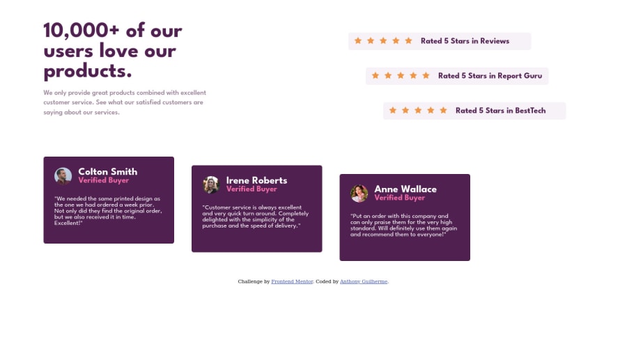
responsive landing page with html and css
Design comparison
Solution retrospective
Feedback welcome
it was a cool challenge and different from the others I was doing, getting out of that comfort zone is always good, I could have done this code much better.
Community feedback
- @vanzasetiaPosted almost 3 years ago
Hi, Anthony! 👋
I am not sure why you are splitting the stylesheets into five different files. From my point of view as someone who wants to give feedback, it makes it harder to give feedback to your CSS. So, unless you have good reasons for doing that, I recommend merging all the CSS files into one CSS file.
Not only it's going to make your site load faster (because it only needs to download and parse one CSS file) but also, makes it easier for people who want to see and give feedback on the CSS code.
Some feedback.
- There's no need to wrap all the
imgtags withfigureelement. The only reason to usefigureis if you need to include afigcaption. Otherwiseimgtag is fine or usesdivinstead. - Those star icons are decorative images. They don't give meaningful information. So, I recommend leaving the
alt=""empty. - Alternative text for images should not contain any words that are related to image. The semantic meaning of the
imgtag is already enough. - The
text-reviewsshouldn't beh3. I recommend usingpinstead. - Move the
footeroutside of themainelement.footerinside themainwould have no meaning (no corresponding role).
Hope this helps. Happy coding! 😄
Marked as helpful0 - There's no need to wrap all the
Please log in to post a comment
Log in with GitHubJoin our Discord community
Join thousands of Frontend Mentor community members taking the challenges, sharing resources, helping each other, and chatting about all things front-end!
Join our Discord
