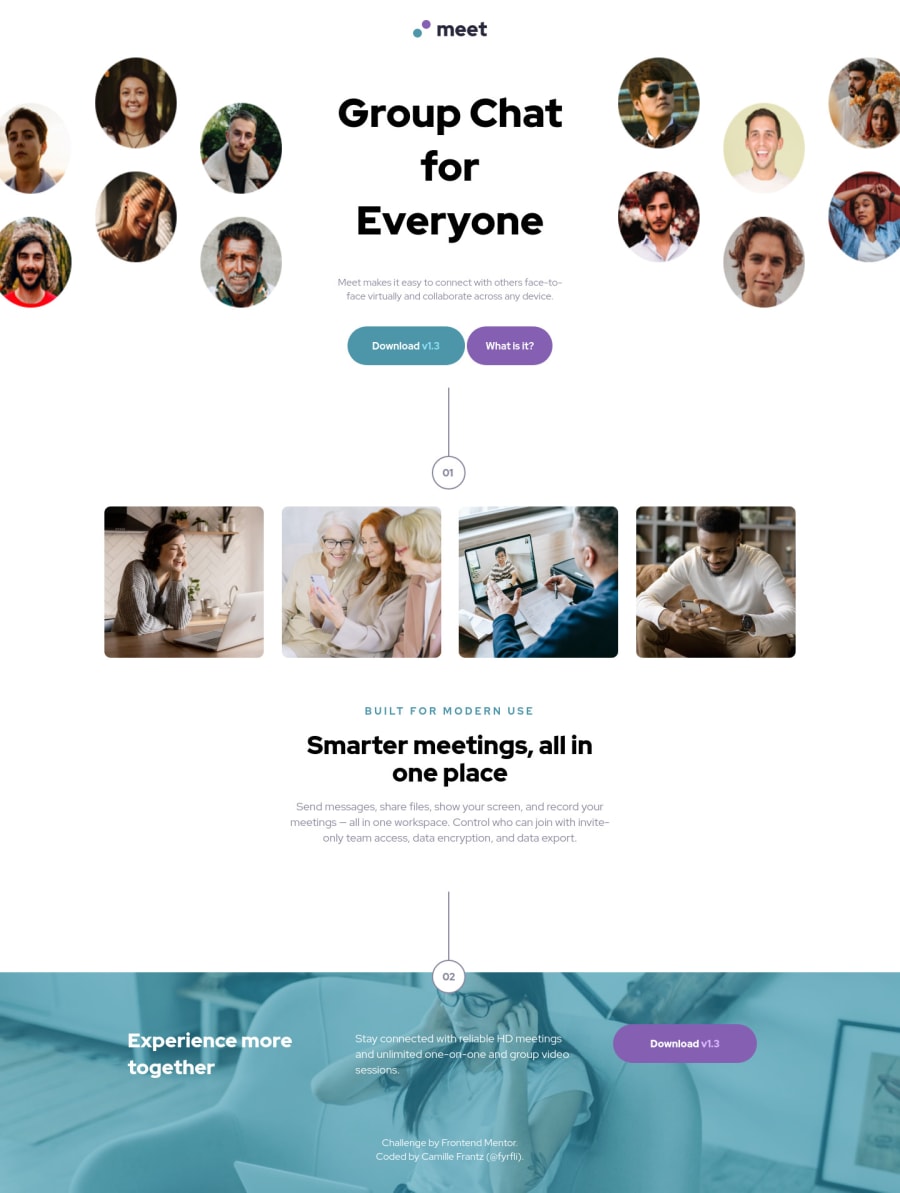
Responsive landing page with grid and background images.
Design comparison
Solution retrospective
I fixed the HTML validation errors.
But here's a question for the community: what do you do about the info messages about headings? Supposed the design does not lend itself well to having headings? Not to say that I couldn't have made some headings in this design but I am curious how we manage those situations where there is nothing to put in a h1-6 section... thoughts?
Community feedback
- @grace-snowPosted almost 3 years ago
Hi
What is it about this that you think doesn't lend itself to using headings? They are essential for giving semantic meeting to a page's contents, and they need to go in order in the html. You can change their order via css if needed, if that's what you mean.
Marked as helpful2@fyrfliPosted almost 3 years ago@grace-snow I think my issue is that some of my sections are just images, no text. Maybe it would have been better to wrap my images in divs instead of sections?
0@grace-snowPosted almost 3 years ago@fyrfli yes you should be using divs
Sections have no additional semantic meaning without aria-label or aria-labelledby anyway. They are just like divs.
You only need to use sections if you think a chunk of content (that has a heading as well) is important enough to need extra affordance, more than that from the heading alone
1 - @grace-snowPosted almost 3 years ago
Now I'm on a computer and able to inspect I can give more feedback for you
- You need a h1 on the page. This is essential for content structure (accessibility) and SEO. Heading order is the most important part of html semantics, followed by element choice
- It looks like you are definitely misunderstanding when to use padding vs margin. Padding is to create space within an element, like a box, when you want to keep content away from edges. Margin is for spacing between elements, like headings, paragraphs, buttons etc.
- What would you expect to happen when someone clicks 'download'? That may be ok as an anchor tag, but I suspect it may be the wrong element choice there
- If using svgs inline like this for those decorative numbers, they need to be aria-hidden. They definitely do not belong in a section. (p.s. did you create these? Or did they come with the starter files?)
- Not essential, but you are cluttering the html with a lot of content in empty divs or that get's ignored by screenreaders. For example, those header images could be in the html (that would be much easier) or they could be in pseudo elements rather than empty divs which is generally considered bad practice. Similarly, those numbers could be in pseudo elements, or even those two sections as list items in an ordered list with the 01 and 02 as the counter elements.
- No sections should ever be outside of other landmarks (in this case main)
I hope this is helpful
Marked as helpful1@fyrfliPosted almost 3 years ago@grace-snow Ah. Beauty. Thank you, Grace. That is some solid constructive critique. I’m excited to give this another go now. 😊
0@fyrfliPosted almost 3 years ago@grace-snow
Ok.
- So I changed my h2 (in .top) to an h1.
- I am going to have to go through my styles with a comb, now, because I could have sworn I understood that concept.
- I contemplated using a button and I have no idea why I rejected that idea. You think a button would be more apt here?
- I created them - I both wanted to understand how to use svg elements and wanted to get fancy. I've included the aria-hidden on them now.
- Replaced all the non-main sections with divs instead.
"Not essential, but you are cluttering the html with a lot of content in empty divs or that get's ignored by screenreaders. For example, those header images could be in the html (that would be much easier) or they could be in pseudo elements rather than empty divs which is generally considered bad practice. Similarly, those numbers could be in pseudo elements, or even those two sections as list items in an ordered list with the 01 and 02 as the counter elements."
I need to do some more reading.
I am so happy I tried this because I get this sort of feedback which is going to make me so much better at this. Thanks again.
0 - @shashreesamuelPosted almost 3 years ago
Hey good job completing this challenge
Keep up the good work
Your solution looks great however I think that the title of the website is supposed to be a bit bigger. Secondly the images need to be a bit bigger as seen in the design
In terms of accessibility issues simply wrap all the content between main tags
I hope this helps
Cheers Happy coding 👍
1
Please log in to post a comment
Log in with GitHubJoin our Discord community
Join thousands of Frontend Mentor community members taking the challenges, sharing resources, helping each other, and chatting about all things front-end!
Join our Discord
