Submitted about 3 years ago
Responsive Landing Page with Flexbox and Sass
#sass/scss
@mscates
Design comparison
SolutionDesign
Solution retrospective
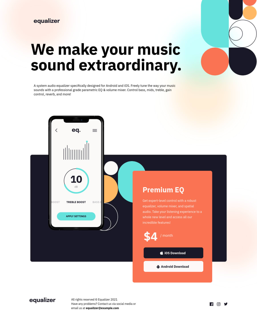
I started out using css grid for the middle section, but I couldn't quite get it to work. I finally used relative and absolute positioning with percentage values for the widths and the responsiveness was much easier . I am sure grid probably can do this easier, but I am not experienced enough yet to understand it. I used background position for the color dots backgrounds, but couldn't get it quite in the correct spot. not sure what the trick is there. I loved this exercise though. It was so much fun.
Community feedback
Please log in to post a comment
Log in with GitHubJoin our Discord community
Join thousands of Frontend Mentor community members taking the challenges, sharing resources, helping each other, and chatting about all things front-end!
Join our Discord
