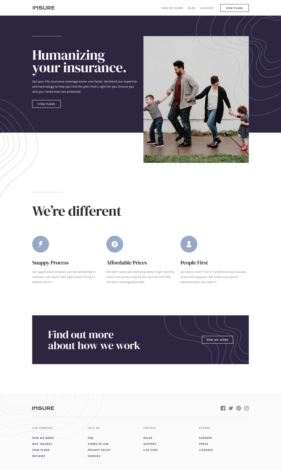
Responsive landing page with flexbox and hamburger menu
Design comparison
Solution retrospective
Any tips how to make my code better are welcome
Community feedback
- @adarshcodesPosted over 4 years ago
Hi! @norlowska, Congratulations on submitting your first solution. Your solution is great, you did nice work on this solution, everything is looking fine, perfect use of z-index, layout, positioning of elements. You can take a look at your responsive codes, after 945px, the main image is going of its container and causes a huge white space on the right side. Great, no HTML or Accessibility issue aroused on your first solution.
2@norlowskaPosted over 4 years ago@adarshcodes Thank you. In fact, there was a problem with negative margins. I believe it caused this white space, I fixed it. But this space was not huge, maybe there is another problem that I missed? I also made image responsive.
0
Please log in to post a comment
Log in with GitHubJoin our Discord community
Join thousands of Frontend Mentor community members taking the challenges, sharing resources, helping each other, and chatting about all things front-end!
Join our Discord
