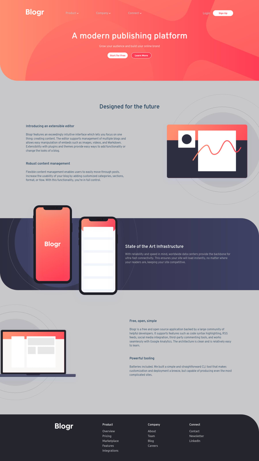
Design comparison
Solution retrospective
I enjoyed making this. But I overcomplicate it. Any useful suggestion on how to make it cleaner would be appreciated. Thanks :)
Community feedback
- @ApplePieGiraffePosted over 3 years ago
Greetings, Jugo-JS! 👋
Good effort on this challenge! 👍
A few things I suggest are,
- Adding
overflow-x: hiddento thebody(or something similar) to prevent a horizontal scroll bar from appearing along the bottom of the page at certain screen sizes. - Changing the background color of the page to match that of the original design.
- Making sure that the text next to the illustration of the laptop doesn't cover up the laptop when the width of the screen decreases in the desktop layout.
Keep coding (and happy coding, too)! 😁
Marked as helpful0@Jugo-JSPosted over 3 years ago@ApplePieGiraffe Thanks :) I appreciate your suggestions and i will try to implement them :)
1 - Adding
Please log in to post a comment
Log in with GitHubJoin our Discord community
Join thousands of Frontend Mentor community members taking the challenges, sharing resources, helping each other, and chatting about all things front-end!
Join our Discord
