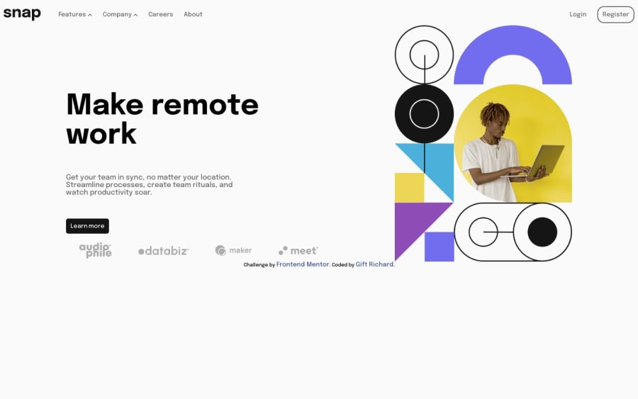
responsive landing page with drop-down navigations
Design comparison
Solution retrospective
Hi there😉! I hope you are having a lovely day, just want to share my process for completing this task.
Firstly, I started with the mobile-first approach, optimizing for smaller screens before building up to larger breakpoints. This helps keep things clean and focused. I rely heavily on Flexbox, keeping markup semantic and scaling spacing/sizing with other CSS functions.
Accessibility is baked in from the beginning - making sure color contrast passes standards, content is logically structured, focus states are visible, ARIA roles are added where appropriate, etc. I test frequently with screen readers to ensure it's usable for all.
For interactivity, I leverage HTML data attributes as hooks and vanilla JS for lightweight logic/component toggles. No need for heavy libraries on simple interactions. The code is formatted neatly with Prettier and documented clearly.
I find that thinking in components helps create consistent, reusable chunks that can be tweaked and composed together. Breaking things down into smaller parts helps tame complexity. but still, I know my code could still use a touch of more perfection, so I am open and eager for your feedback, All helpful feedback is welcomed😊
Community feedback
Please log in to post a comment
Log in with GitHubJoin our Discord community
Join thousands of Frontend Mentor community members taking the challenges, sharing resources, helping each other, and chatting about all things front-end!
Join our Discord
