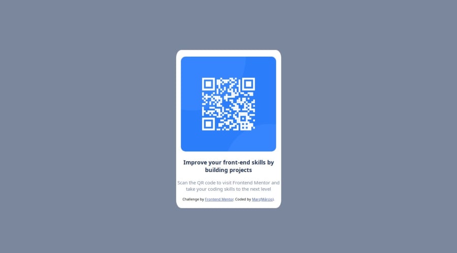
Design comparison
Solution retrospective
The exercise is simple for begginers and advanced programers. Good for fun in html and css codes.
What challenges did you encounter, and how did you overcome them?i've just difficultys in find the width and height of elements, but if you download figma project and que search for this params you find out.
What specific areas of your project would you like help with?just the params of elements, but it's not problem seriously.
Community feedback
- @toydala99Posted 7 months ago
Hello Márcio, I'm going to leave my comment about your solution to the QR Code Component challenge, below are some improvements you can make to your solution.
The semantics of HTML can be improved, for example the footer tag does not need to be inside the main-box div, you can again use a div to contain the h3 tag and p tag, use the footer to make the footer section of your pages, Just as you should use the nav tag to do the navigation part of your pages, always try to make everything as semantic as possible HTML semantics should be improved.
It should add responsiveness to the page.
The solution is not faithful to the design, it should be improved.
I recommend taking the w3schools HTML and CSS course, it's very good.
Marked as helpful0@ImMarcioPosted 7 months ago@toydala99 Thanks for you feedback, i go try improved in the nexts challenges design and remake this challenge, thanks for help.
1
Please log in to post a comment
Log in with GitHubJoin our Discord community
Join thousands of Frontend Mentor community members taking the challenges, sharing resources, helping each other, and chatting about all things front-end!
Join our Discord