


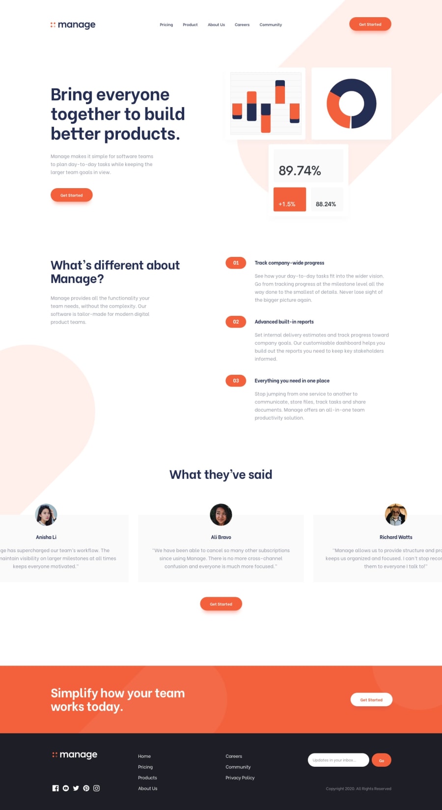
Design comparison
Solution retrospective
One thing that always seems to confuse me is css media query. This project allowed me to use media query a lot but I hope I get to a point where I totally figure it out instead of guessing between min or max width for the page to be responsive.
Community feedback
- @danielmrz-devPosted 12 months ago
Hey @T0m0re!
Your project looks very good!
About
media queries, I know how you feel. But I have something that helps me a lot.I always use the mobile first approach. Always start a project by its mobile version.
Most projects here at Front-end Mentor have a
375pxversion and a1440pxversion.So I start creating the mobile version and once it's finished, I create a
media queryfor the desktop version:@media (min-width: 1440px). So this helps me understand that in order to the project show me the desktop version, it needs to be at least this wide.Long story short, if you start by mobile version, you're gonna have to use min-width to create versions for bigger screen sizes. And if you start by desktop version, you're gonna have to use max-width to create versions for smaller screen sizes.
I hope it helps!
Marked as helpful0@T0m0rePosted 12 months agoThanks you for this, will try this approach in my next project. @danielmrz-dev
1

Please log in to post a comment
Log in with GitHub
Join our Discord community
Join thousands of Frontend Mentor community members taking the challenges, sharing resources, helping each other, and chatting about all things front-end!
Join our Discord