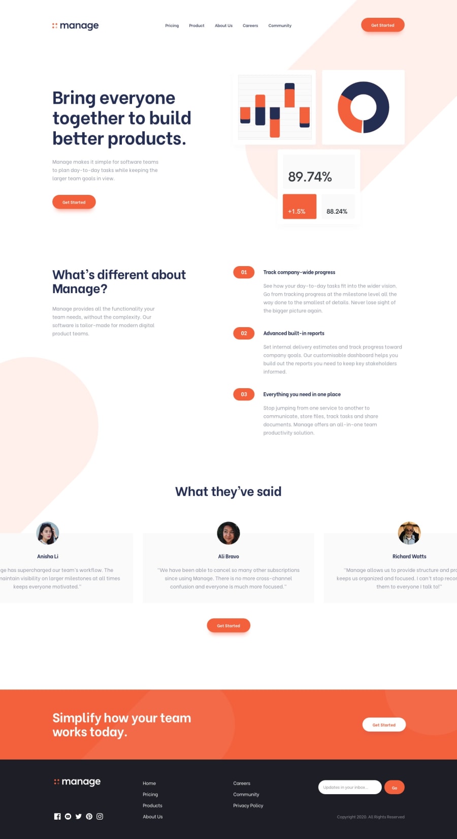
Design comparison
SolutionDesign
Solution retrospective
This looked harmless at the beginning but turned out to be quite the challenge. A lot of CSS decisions I made felt quite hacky- especially in the footer. If anyone has feedback or suggestions on how to write the markup and CSS for the footer more efficiently, please let me know.
I was also lost on how the svgs supplied are supposed to be used for the background if anyone has insight on that.
Also trying to look into a way for the carousel buttons on mobile to detect scroll to update the state of each button depending on which item is in view.
Thanks in advance!
Community feedback
Please log in to post a comment
Log in with GitHubJoin our Discord community
Join thousands of Frontend Mentor community members taking the challenges, sharing resources, helping each other, and chatting about all things front-end!
Join our Discord
