Design comparison
Solution retrospective
It was fun coding this page, I feel my CSS implementation is getting better. I will love feedback on anything that can be improved on in my code.
Community feedback
- @ApplePieGiraffePosted over 3 years ago
Hello, Israel Adefidipe! 👋
Good work on this challenge! 👍
A few things I'd like to suggest are,
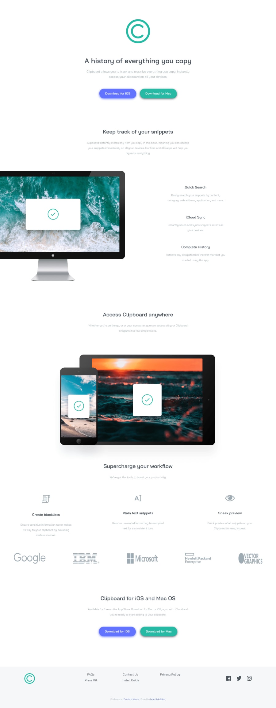
- Adding the background image from the original design to the top of the page.
- Making sure the logos in the section near the bottom of the page maintain their original aspect ratios and do not become stretched or squeezed when the size of the screen changes.
- Turning the social media links in the footer of the page into actual links by wrapping them in an anchor tag.
- Giving the navigation links in the footer of the page a hover state.
Keep coding (and happy coding, too)! 😁
2 - @pikapikamartPosted over 3 years ago
Hey, upon seeing it, your background image is not loading and I saw that you use the path
background-image: url(/images/bg-header-desktop.png);, when you deploy github or other I guess, I do not recommend using/in path navigation since it goes to the root folder not on the same level of directory. So instead of the you could just omit it and use onlyimages/bg-header-desktop.pngsince it is on the same level deep as the style.css . Apart from that, nothing else it is already good but remember to not use/, there are occasion where we use it, but not this instance maybe ^^1@iadefidipePosted over 3 years agoThanks pikamart... I will change that immediately
0
Please log in to post a comment
Log in with GitHubJoin our Discord community
Join thousands of Frontend Mentor community members taking the challenges, sharing resources, helping each other, and chatting about all things front-end!
Join our Discord
