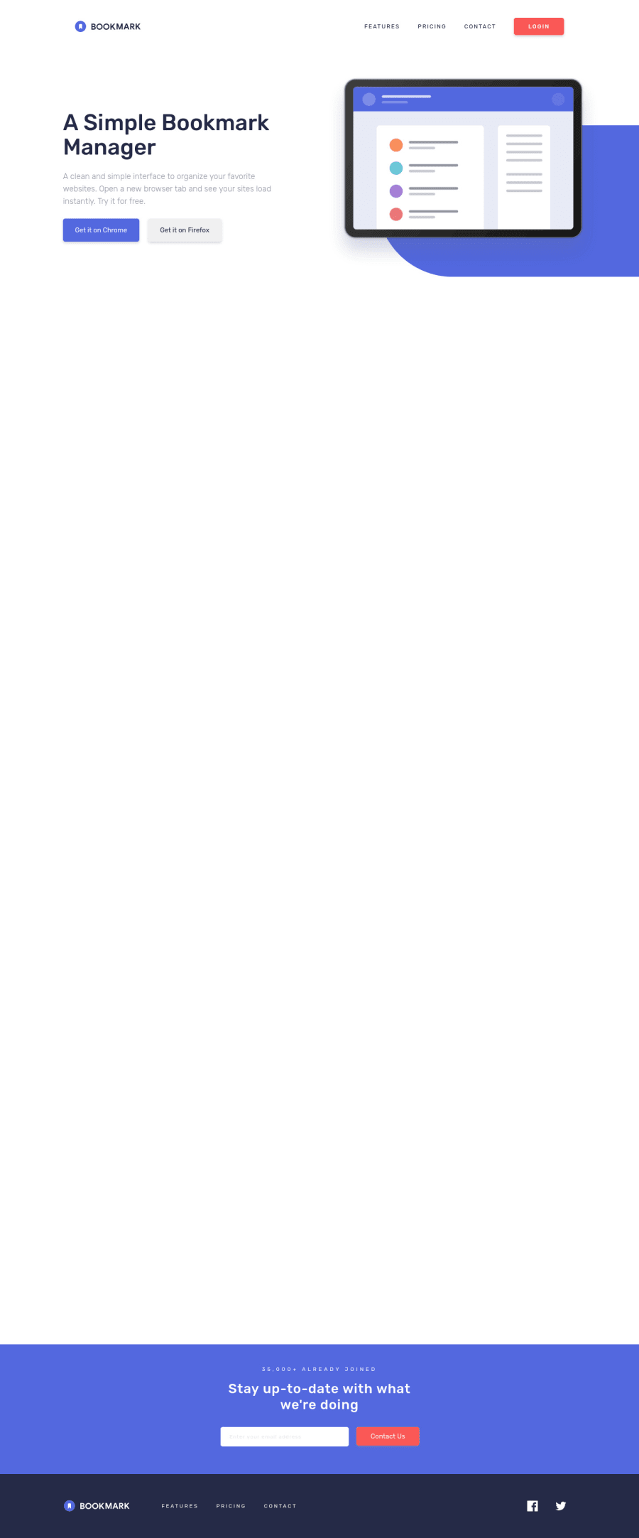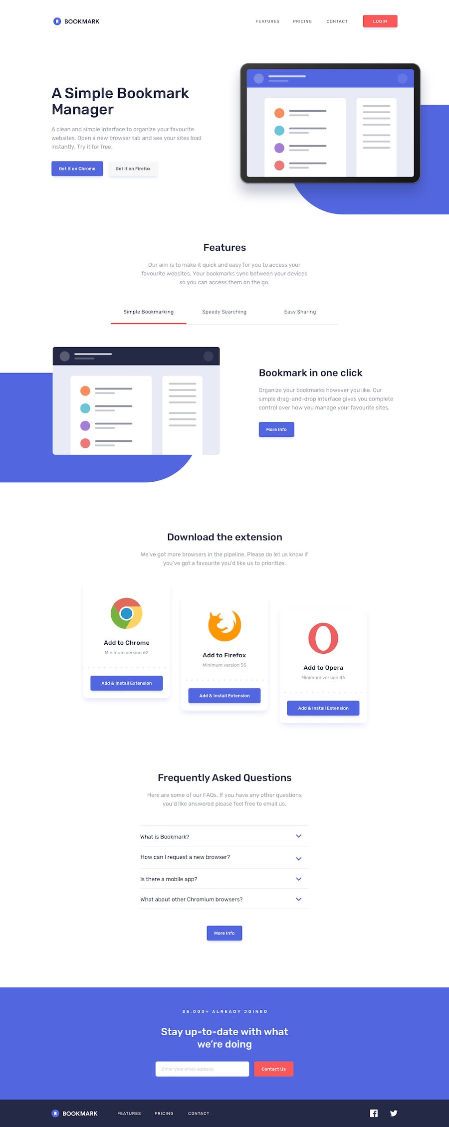
Responsive Landing Page w/ Section animations (React/SASS/GSAP)
Design comparison
Solution retrospective
Using SASS mixins really helped me implement a mobile-first, responsive design. What are your best tips for building a responsive design?
If you have any advice or see room for improvement please let me know.
Community feedback
- @lissajous-laserPosted about 2 years ago
Great design, really like the gradual scaling you've done on the soft-blue background elements.
I'm pretty new to responsive design as well, one thing I've done was use window.innerWidth like your Nav component, but I use it on my App component, store it with useState, and update it with useEffect. Then it can be passed to any child component that requires the current window width. It's most helpful when you need to change the component structure, but it also helps with programmatically adding classes to an element so that certain styles can be applied at a particular window width.
Marked as helpful1@zflegle3Posted about 2 years ago@lissajous-laser Thanks! Your solution looks great and almost identical to the design, awesome work too!
That's a great way to use innerWidth. It definitely makes sense to save it once and pass it to child components. Thanks for the tip!
1
Please log in to post a comment
Log in with GitHubJoin our Discord community
Join thousands of Frontend Mentor community members taking the challenges, sharing resources, helping each other, and chatting about all things front-end!
Join our Discord
