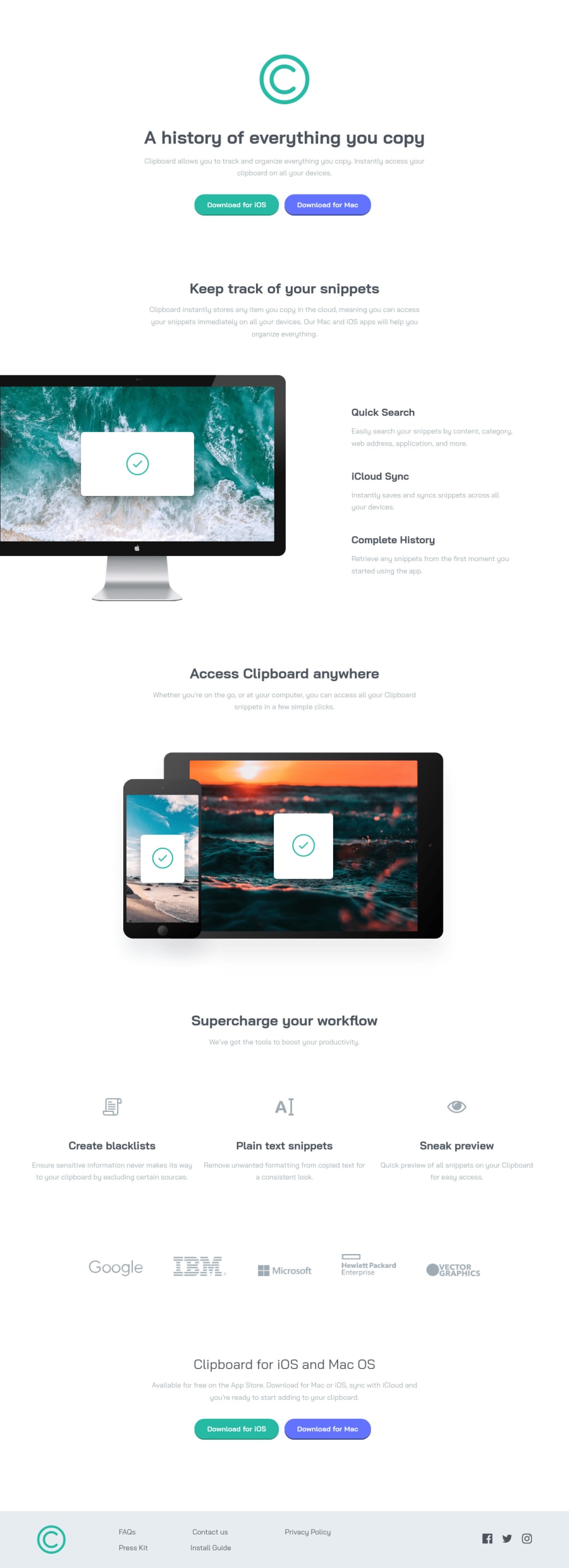
Design comparison
Solution retrospective
By seeing my code how can I improve in your opinion?
What are the most mistakes that I am making in my code? so I do not make it in the future.
For the responsive design coding, how can I improve it
In general, give me a piece of advice that can help me.
Thank you :)
Community feedback
- @ChamuMutezvaPosted almost 3 years ago
Greetings Khaled
- heading elements should follow a sequential order and having only one h1 element on a page is considered best practice.
- the immediate child of a
ul
should be ali
element, a div element should not be a direct child of a ul element - when using an svg , you need to add additional attributes such as
role=img
for accessibility, for other attributes see the following article, creating accessible svgs
Marked as helpful1@MUGK1Posted almost 3 years ago@ChamuMutezva
Hello Mr.Chamu,
About the divs and ul li that was a very helpful comment, no no your whole comments are helpful and I know that I will not find these comments any were
I appreciate your helping Thank you very much
0 - @RioCantrePosted almost 3 years ago
Hello there! Nice work with this project. Looking at your solution, I would suggest the following for you...
- Add the background image in the
body
rule set - Considered viewing it between 430px - 900px, the responsive design is stacking up
- Include the hover state of the buttons and links. For the button add
background: hsla(171, 52%, 58%, 1);
in the.btn.btn--cyan
,.lis
and.footer__icons
. Addbackground: hsla(232, 100%, 77%, 1);
for the.btn.btn--blue:hover
. - Refactor the HTML structures into...
<article class="features"> <img src="images/image-computer.png" alt="image computer" class="features__image" /> <div class="features__ul"> <div class="features__list"></div> <div class="features__list"></div> <divclass="features__list"></div> </div> </article>
better to use
div
to wrap a section consisting withh3
andp
rather than use unordered listul
andli
- Instead of wrap the image with
section
usediv
instead,section
requires at least one of the heading hierarchy
<div class="img"> <img src="images/image-devices.png" alt="devices image" class="img__devi" /> </div> <section class="u-mave-up track"> <h2 class="track__title heading-1">Supercharge your workflow</h2> <p class="track__para para-main"> We’ve got the tools to boost your productivity. </p> </section>
- Remove the commented/unused code to keep it clean
Hope this helps and Keep it going!
Marked as helpful1@MUGK1Posted almost 3 years ago@RioCantre
Hi Mr.Rio,
I am appreciating your going through my whole code and I will definitely work on your helpful comments
Thank you very much :)
1 - Add the background image in the
- Account deleted
Hi there 👋
Congratulate on finishing your project 🎉. The design looks beautiful 😃. Please answer my question: Have you learned the SASS course from Jonas Schmedtmann because the code looks very familiar to me?
Your code is creat I mean overall like writing your code using sass and responsive code. However, just for one landing page creating 4-5 folders and a dozen files is not a good practice 🤔. You can put them in files
base
,main
,layout
andcomponents
that's all 🙌 because what you are doing is a lot of work. If the website has a few pages then you can divide it ✂.Let's add some hover effects to buttons to make it better 😉 about your design
Happy coding ☕
Marked as helpful1@MUGK1Posted almost 3 years ago@maqsudtolipov
Hi Mr.Maqsud Thank you for your helpful reply
About your question, yes I learned from him and he was very good at everything I liked his way of coding and teaching that is why I will be like that on coding
I know that a lot of folders is not good and it will make everything messy for one page of course but I want to work on organizing like that so when I make a big project I know what to do, but of course, I will not do this again in small projects like this one
I forgot to do hover effects on the buttons I will make it so it will the page more stand
Thank you again, I appreciate it.
1
Please log in to post a comment
Log in with GitHubJoin our Discord community
Join thousands of Frontend Mentor community members taking the challenges, sharing resources, helping each other, and chatting about all things front-end!
Join our Discord