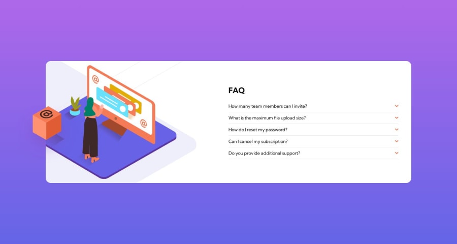
Responsive landing page using Vite and Tailwind CSS
Design comparison
Solution retrospective
I had problems with the images and adapting these to different devices, is there a better way to do this?
Community feedback
- @Dev-TronPosted over 1 year ago
There are actually a couple ways you can easily achieve this affect. You could use the display: show or hide property to display the images at different breakpoints using media queries. You can find out more about media queries here. https://developer.mozilla.org/en-US/docs/Web/CSS/CSS_media_queries/Using_media_queries. My next and favorite way of doing it is using the picture element. You can find out more about that in the mdn web docs as well. So basically, you're placing your images between picture tags and setting the breakpoints. It's as easy as that. Good luck and hope this info help you in the future.
0
Please log in to post a comment
Log in with GitHubJoin our Discord community
Join thousands of Frontend Mentor community members taking the challenges, sharing resources, helping each other, and chatting about all things front-end!
Join our Discord
