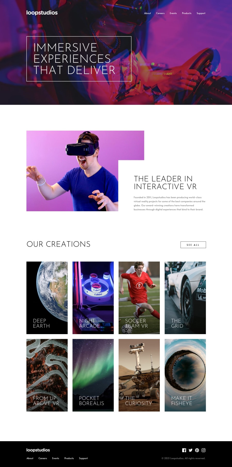
Design comparison
Solution retrospective
I'm pretty happy with how the mobile/desktop navigation menu turned out. There are some finer styling details that can surely be improved, but it's probably one of the more semantically proper and accessible hamburger menus I've implemented here. This is largely thanks to Jessica Chan's excellent video tutorial (linked and acknowledged in my project Readme) on the topic.
What challenges did you encounter, and how did you overcome them?I spent a fair amount of time wrestling with integrating the updated pure CSS for the mobile nav functionality (that I was comfortable with) with the Tailwind code I had originally put in place. Ultimately, I left most of the heavy lifting of the menu to the vanilla CSS and JS.
What specific areas of your project would you like help with?I'm definitely still learning to become proficient with Tailwind, so there's certainly a lot of areas around class usage I can improve upon. Being new to the framework, it's difficult to gage if my html is overly polluted with classes, especially given the layout isn't the most complex. Of course, proficiency will come with time and practice but I'm happy to receive any and all feedback on my Tailwind implementation.
Community feedback
Please log in to post a comment
Log in with GitHubJoin our Discord community
Join thousands of Frontend Mentor community members taking the challenges, sharing resources, helping each other, and chatting about all things front-end!
Join our Discord
