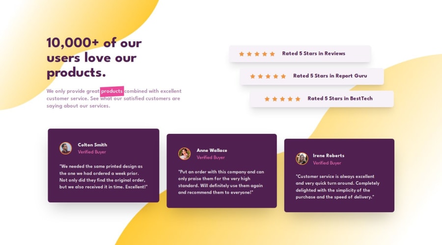
Responsive landing page using Tailwind CSS, fr motion and grid, flex.
Design comparison
Solution retrospective
Hi Front-End Mentor Community🙋♂️ I'm Bishal and this is my solution for this challenge.🧑🎓
🎮Features
- Secured a flawless 100% Lighthouse score across performance, accessibility, best practices, and SEO benchmarks, showcasing our commitment to excellence.📊
- Developed with Next.js for optimized performance and enhanced user experience.🚀
- Utilized Framer Motion for seamless animations and delightful interactions.💫
- Codebase is well maintained and formatted using Prettier.💻
- Integrated ESLint for code quality assurance and maintainability.🛠️
- Implemented autoprefixer for seamless CSS compatibility across different browsers, ensuring a consistent user experience.🌐
- Responsive layout with mobile first approach.📲
- Incorporated Framer Motion transitions(entrance slow animation) for fluid animations and engaging user interactions.🌠
🛠️Built With
- HTML5📃
- TailwindCSS 🎨
- React.js👾
- Next.js 14.1.0🔺
- TypeScript🤖
- TSX📜
- Framer-motion🎭
This project enhance my skills in grid properties. What I did is, I took pen and paper and make grid on it and this approach helps me a lot and easily make this layout responsive with grid. Initially it took me too much time, before writing grids in paper. @Grace guide me to do it like this and it helps me a lot to complete this challenge. Thanks Grace.
And 1 advice who want to gain skills and want to be confident in grid properties and responsiveness then this challenge is for you
At Last don't forget to give feedback, your feedback is crucial for our improvement! Help us make this project even better by sharing your thoughts. Thank you!💓
Community feedback
Please log in to post a comment
Log in with GitHubJoin our Discord community
Join thousands of Frontend Mentor community members taking the challenges, sharing resources, helping each other, and chatting about all things front-end!
Join our Discord
