Design comparison
Solution retrospective
First project using Tailwind, hoping to get better at responsiveness
Community feedback
- @wendyhamelPosted over 2 years ago
Hi there! Nice to see you try Tailwind.css! (I'm a big fan)
A few pointers I got for you:
The first thing I noticed is your footer and CTA section with the inline style nagative margin. When I was looking at your site this actually broke the layout. (It gave me a horizontal scrollbar in chrome) I was wondering why you set this up like that?
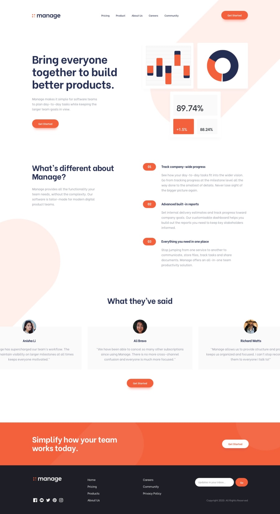
The site looks good at first glance. Mobile (375px screen width) is especially pretty. (Once I disabled your negative margins)
Another thing I noticed was that your testimonial section always shows one testimonial, when the design hows 3 on larger screens.
Going bottom to top here, sorry about that..
The header texts in your solution are black while in the design they look a dark blue / gray to me.
The last thing I think you can fix is the background image in the header. It's on the right on larger screens and slightly overflows on top and right sides of the screen. Yours is on the left. It can be done with tailwind. Take a look at overflow-hidden class and instead of a background on the body you can play around with absolutely and relatively positiond div's. You can set the image as a background image in a div, but you can also just put it in an image tag for more control with the tailwind classes. There are also some usefull max-screen-width classes to help you out to prevent your content to spread to wide. You can read about these in the tailwindcss docs. And if you like, you can take a peak at my solution for the Easybank landing page where I use this to position the background image. Feel free to give me some feedback, if you see anything I could improve.
Keep coding!
Marked as helpful1@RonenTGreatPosted over 2 years ago@wendyhamel Thank you Wendy for the feedback, with the negative margin I used it because with smaller (280px), the CTA and Footer were going off the screen. But I have taken your suggestions and I have removed it. Also thank you for the heading colour, I didn't realize it😅, my screen filter was on but it has been fixed now. With the position of the image background, I will look into it and make the necessary changes. Thank you very much.
0@wendyhamelPosted over 2 years ago@RonenTGreat Happy to hear that, I'm glad I could help.
0
Please log in to post a comment
Log in with GitHubJoin our Discord community
Join thousands of Frontend Mentor community members taking the challenges, sharing resources, helping each other, and chatting about all things front-end!
Join our Discord
