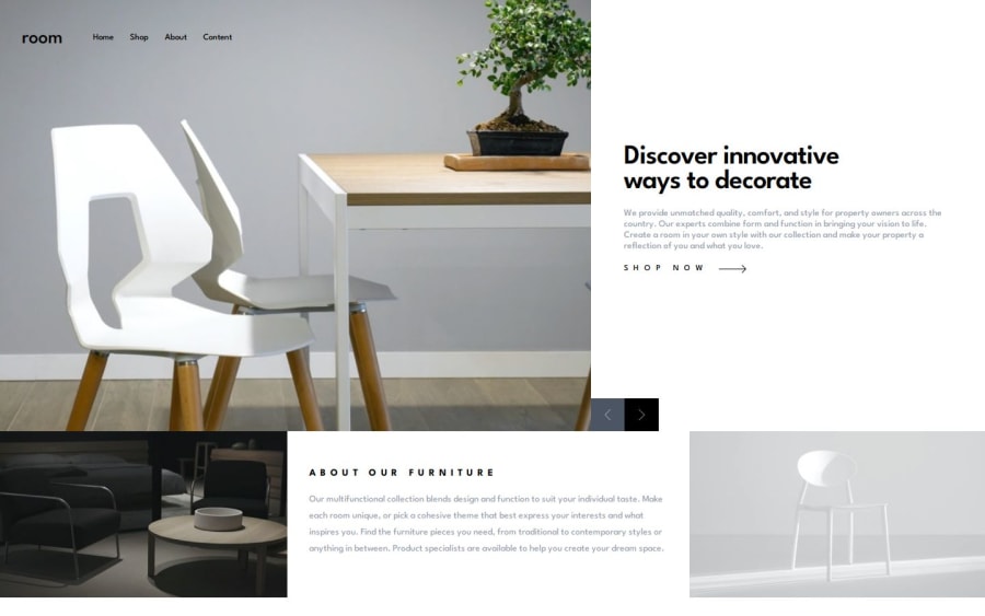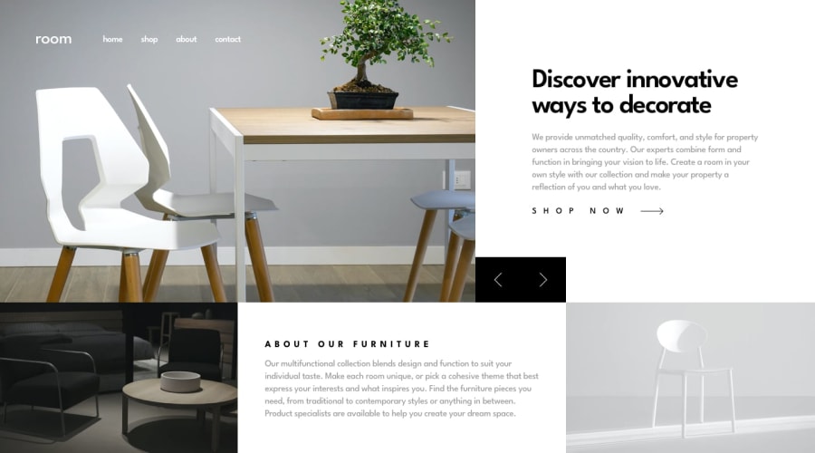
Responsive landing page using Svelte, TailwindCSS and JSDoc
Design comparison
Solution retrospective
In regards to styling using TailwindCSS, I'm improving my notions of when it comes to what should be gathered/organized in the tailwind.config file, and what shouldn't. I'm also enjoying my improvement when it comes to debugging front-end code; I'm getting quicker.
For the next project, I may not use SvelteKit; I ended up "over engineering", as I just had to build a landing page. Svelte only would have been enough. For the next project, I also want to create a more accessible structure; I still have to improve my "accessibility senses/notions".
What challenges did you encounter, and how did you overcome them?For the first time, I used CSS key-frames + transitions; well, by reading their functioning logic, I was able to apply a smooth transition for the mobile drop-down menu. Working with the slider buttons also wasn't that easy, as, depending on the screen size, it has to appear on one section rather than another. I ended up creating two very similar structures, and, depending on the size of the screen, I changes their display value to either show or hide on desktop/mobile screens; I probably should improve that.
What specific areas of your project would you like help with?I'd love tips on how to structure a smooth slider/carousel, using pure CSS; I struggled on this front. I'd also enjoy comments on the CSS units I ended up using; I may have chosen not the ideal units for different jobs.
Community feedback
Please log in to post a comment
Log in with GitHubJoin our Discord community
Join thousands of Frontend Mentor community members taking the challenges, sharing resources, helping each other, and chatting about all things front-end!
Join our Discord
