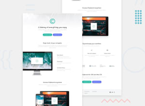
Design comparison
Solution retrospective
Any feedback is appreciated, especially about html structure, responsive and scss.
Community feedback
- @brasspetalsPosted almost 3 years ago
Hi, Lasha! Congrats on submitting your first solution! 🎉
When it comes to your HTML, you did a very good job overall. Just a few suggestions:
- Adding a visually hidden heading to your
.section-imgto describe to screen readers what that section is - something like “Used by the the following companies”. Here’s an article that describes different methods to add text just for screen readers. Adding alt text descriptions of each logo would be a good idea in this section too, so that screen readers will know what companies are using the product. - The
.footer-navcan be anavelement instead of adivto give it more semantic meaning.
For responsiveness, your paragraphs get quite stretched out before switching to the desktop layout. You may want to consider adding max-widths to them. Using
chunits for this might be handy.Marked as helpful1 - Adding a visually hidden heading to your
- @shashreesamuelPosted almost 3 years ago
Hey good job completing this challenge
Keep up the good work
Your solution looks great however I think that the following should be considered
-
The title of the website should be a bit bigger
-
The header should have a background image as seen in the design
-
The titles for each section should be a bit bigger
I hope this helps
In terms of your accessibility issues simply wrap all your content between main tags
Cheers Happy coding
Marked as helpful1 -
- @rohitKumar38344Posted almost 3 years ago
Everything looks good. You just forget to add background image on header section
1
Please log in to post a comment
Log in with GitHubJoin our Discord community
Join thousands of Frontend Mentor community members taking the challenges, sharing resources, helping each other, and chatting about all things front-end!
Join our Discord
