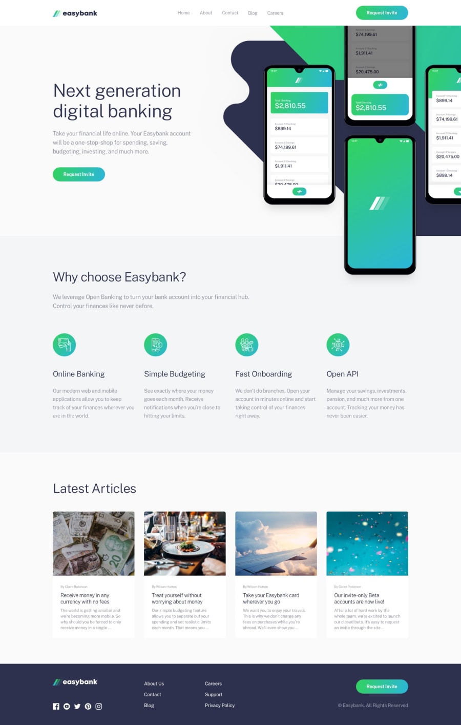
Design comparison
SolutionDesign
Solution retrospective
So, I wasn't able to properly positon the background image on the desktop site. I tried every means I could think of, but I wasn't able to. So, I just left it as background-position:center. I'd really appreciate feedback on how I can better place the background image. Thanks!
Community feedback
- @brasspetalsPosted over 2 years ago
Hi, Shauib! Congrats on submitting another solution. 😄
Placing the background image in
.main-sectionand then adjusting thebackground-positionandbackground-sizeproperties might be easiest in this case. That way, the image won't overflow the section along with the phone mockup image, which you do want to overflow.Marked as helpful0
Please log in to post a comment
Log in with GitHubJoin our Discord community
Join thousands of Frontend Mentor community members taking the challenges, sharing resources, helping each other, and chatting about all things front-end!
Join our Discord
