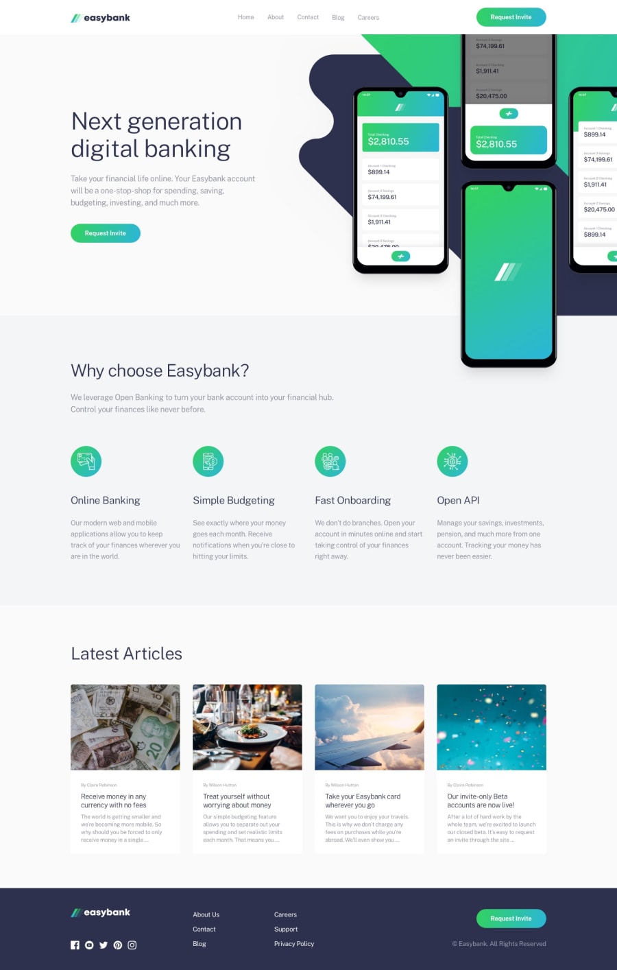
Responsive landing page using Sass and JavaScript
Design comparison
Solution retrospective
Hello people! I have a problem with the mobile navbar. This time I'm using JavaScript to make it work and it almost does. The hamburger icon changes to "X" when menu is opened, also changes back to hamburger when clicked outside the menu or when menu item is clicked. Icon doesn't change to hamburger when you just want to exit by clicking it.
Heres the issue on GutHub: https://github.com/magdakok/Easybank/issues/27
Thank you in advance for any help :))
Community feedback
- @DiarrahPosted over 4 years ago
You did a nice job on this!
Out of all the projects I've done this one gave me the hardest time because of the hero image overlay onto the next div.
If you look at my solution for this, the JS toggle for mobile nav is really simple - maybe around 5 lines - and I think that would definitely help!
2@magdakokPosted over 4 years ago@Diarrah will do! I had a very hard time yesterday night with the mockup picture and background, cause I didn't like the way I did that and.. I just made it worse :D
Thank you, I'm going to learn something from your code now! :)))
1 - @magdakokPosted over 4 years ago
Wow, the screenshot looks very bad! How should I measure the design jpg file to get accurate numbers? File width is 1440px but Google Inspect tool shows that 1440px is way wider.
0
Please log in to post a comment
Log in with GitHubJoin our Discord community
Join thousands of Frontend Mentor community members taking the challenges, sharing resources, helping each other, and chatting about all things front-end!
Join our Discord
