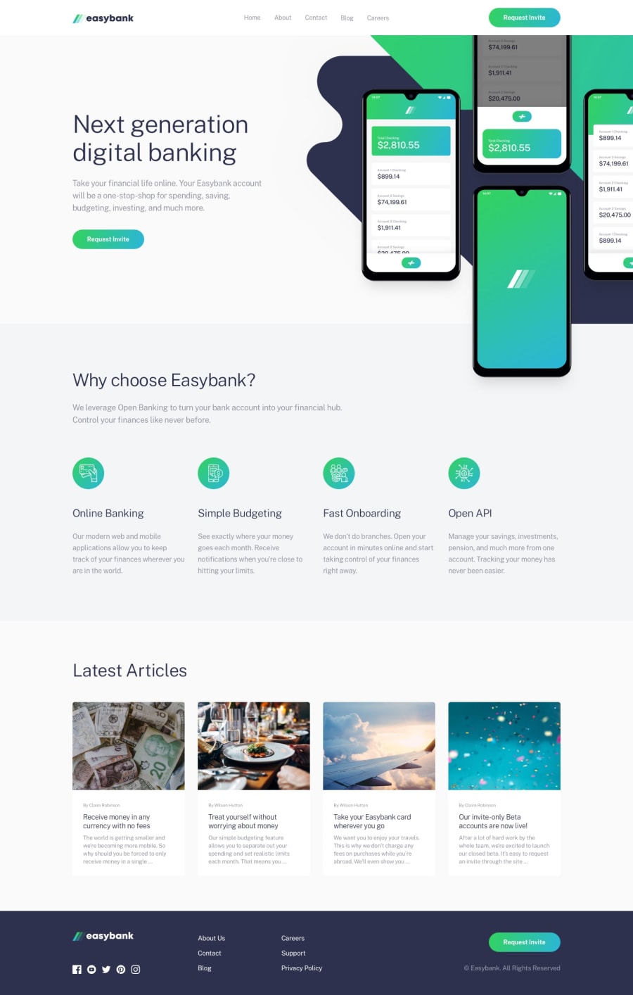
Design comparison
SolutionDesign
Solution retrospective
Any feedback is appreciated.
Community feedback
- @ApplePieGiraffePosted about 4 years ago
Hey, good job, Soumya Chalakkal! 👍
I suggest,
- There seems to be some empty white space to the sides of the content of the page in your solution (and a horizontal scroll bar along the bottom of the page when the screen width decreases). Getting rid of extra space would be a good idea.
Keep coding (and happy coding, too)! 😁
0
Please log in to post a comment
Log in with GitHubJoin our Discord community
Join thousands of Frontend Mentor community members taking the challenges, sharing resources, helping each other, and chatting about all things front-end!
Join our Discord
