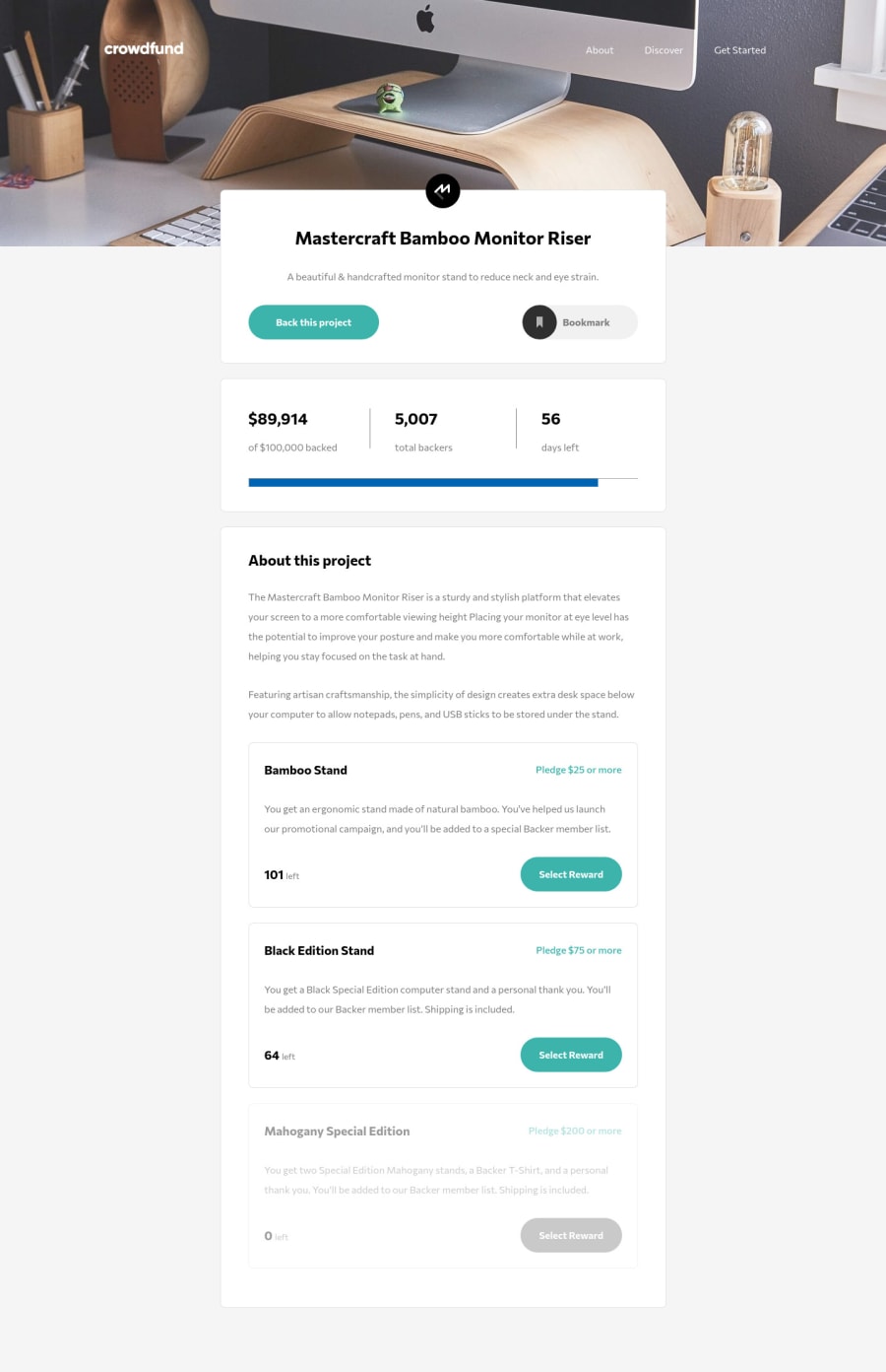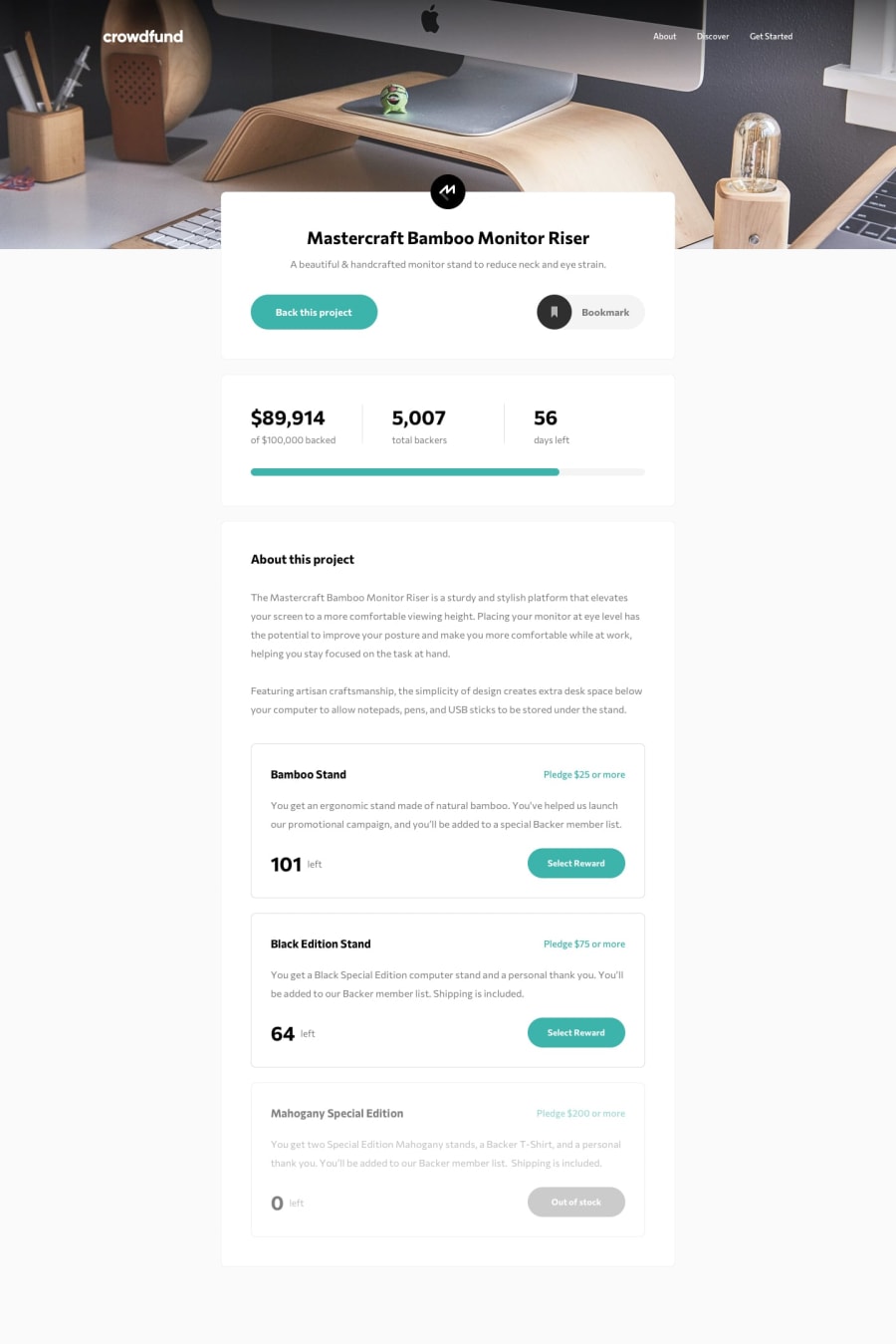
Responsive landing page using react JS
Design comparison
Solution retrospective
Still need a lot improvement for the code especially for the modal popup and when click the pledges you want. Also need improvement for the react useState best practice. Any suggestion will be very appreciated.
Community feedback
- @boedegoatPosted almost 3 years ago
Good work @madegilangaditya. The design is pretty neat and responsive as well. To get rid of those accessibility issues, you can wrap all of your components with a
<main>tag. Also, I think it would be nicer if you make clicking outside will close the mobile menu or modal. Other than that, keep it up and enjoy coding.0@madegilangadityaPosted almost 3 years ago@boedegoat thanks man will try fix the accessibility issues
0
Please log in to post a comment
Log in with GitHubJoin our Discord community
Join thousands of Frontend Mentor community members taking the challenges, sharing resources, helping each other, and chatting about all things front-end!
Join our Discord
