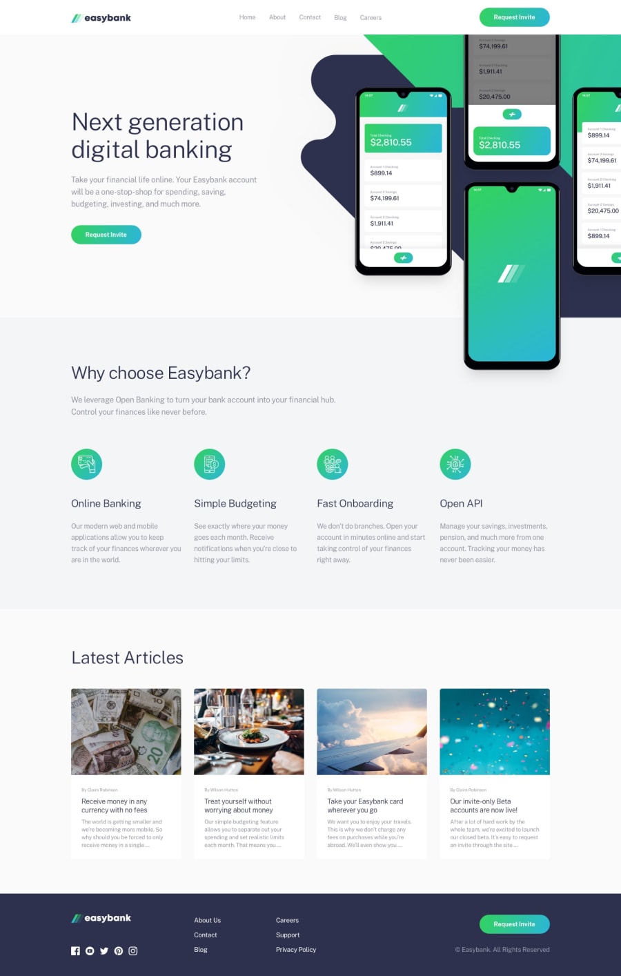
Design comparison
SolutionDesign
Solution retrospective
The main hero image was a little finacky but I was happy to just get it looking good. I belive it could have been done in a cleaner way, maybe with :before and :after pseudo elements? If someone could expand on that or give an example, would be appreciated. Other than that, how else could I have matched the design better? Thanks!
Community feedback
Please log in to post a comment
Log in with GitHubJoin our Discord community
Join thousands of Frontend Mentor community members taking the challenges, sharing resources, helping each other, and chatting about all things front-end!
Join our Discord
