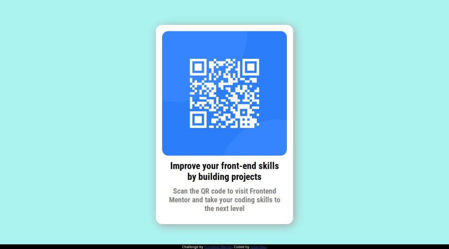
Design comparison
Solution retrospective
I'm glad I didn't encounter any biggest problems. Next time I will refine the shadow.
What challenges did you encounter, and how did you overcome them?The box shadow function is completely foreign to me, i found easy solution on W3C about it.
What specific areas of your project would you like help with?Everything is clear in this project
Community feedback
- @DanijelAdrinekPosted 8 months ago
The colors arnt the same as on Figma, the card is much bigger than on the design, you can always check out how big an object is in figma, and your result should match the design, we do this by lowering the size of the browser down to the size of the screen in the design, then taking a screenshot (I like to use ctrl + shift + s ), then pasting the screenshot in figma, lowering the opacity to 50%, and putting it over the image of the design so that you can see the differences perfectly.
The style needs to be its own separate file, and not written in index.html, we link them using link tag in head of index.html
instead of div with a class of container, you should put main tag with a class of container, it makes it easier for the browser to read.
I hope you found this comment helpful, and here is an example of how I did the project because it should give you an idea of how I managed to build the project, and I hope it helps: https://www.frontendmentor.io/solutions/just-css-and-html-its-too-small-of-a-project-to-need-ro-add-anything-9zhphjxoE5
If you have any questions or need any help, feel free to reach out :)
Marked as helpful1@rzuaniskoPosted 8 months ago@DanijelAdrinek , yeah i see color of the body isnt the same, but i decide don't change. :)
On another project i separate style.css on another files. I need to learn good practice.
I never used tag before. I learned only with class and this method is simply for me. But good to know.
You comment is very helpfull, and i hope my poor english is understandable for you :) Thanks for your help!
1 - @krishnalokamPosted 8 months ago
I see your code and few suggestions from my side , you used { position: absolute; top:50% ; left:50%; } Inorder to align the item in the middle we can keep { margin: auto; } it will align the item in the middle of the viewport width, Hope it helps
0@rzuaniskoPosted 8 months ago@krishnalokam thanks for your answer. Margin auto is good, but it works only on X axis (at least for me). Position absolute, and transform translate working on X and Y, for this i used that.
1 - Account deleted
If the layout would have minor changes like font shadows in different screen sizes it will look good.
0
Please log in to post a comment
Log in with GitHubJoin our Discord community
Join thousands of Frontend Mentor community members taking the challenges, sharing resources, helping each other, and chatting about all things front-end!
Join our Discord