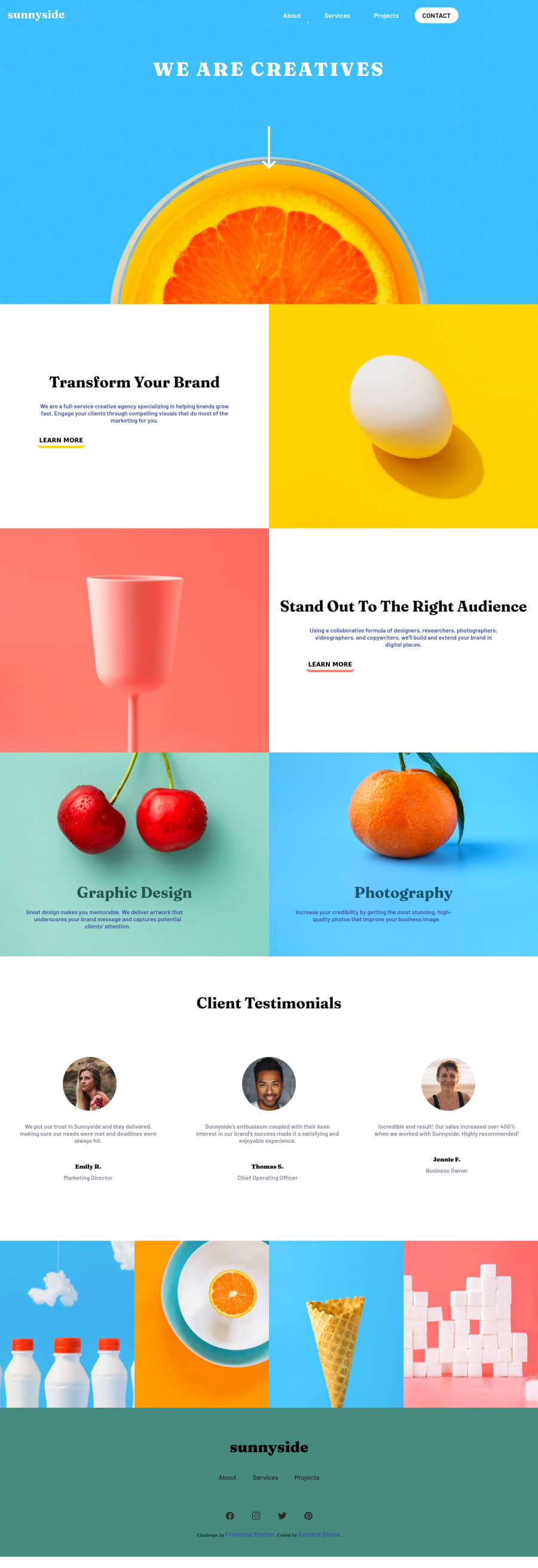
Responsive landing page using only CSS flexbox and html
Design comparison
Solution retrospective
my first project, please give me some feedback
Community feedback
- @ohermans1Posted about 3 years ago
Wow! For a first project, you have done an awesome job!
The only minor issue I can see is the incorrect font and font alignment above the learn more buttons. Also, adding a little padding to these boxes would make the header text and paragraph text look a little closer to the original.
Where you have the classes .transform-brand, .standout etc, it may have been better to make one class, as the styling is the same across these? You could then just add a text-align right, a padding of about 3 rem and correct the font color and you'll be good to go!!
Anyway, great job overall! Looking forward to seeing your next project!
Marked as helpful0
Please log in to post a comment
Log in with GitHubJoin our Discord community
Join thousands of Frontend Mentor community members taking the challenges, sharing resources, helping each other, and chatting about all things front-end!
Join our Discord
