Submitted almost 3 years ago
Responsive landing page using mobile first, sass
#sass/scss

@turtlecrab

Design comparison
SolutionDesign

Solution retrospective
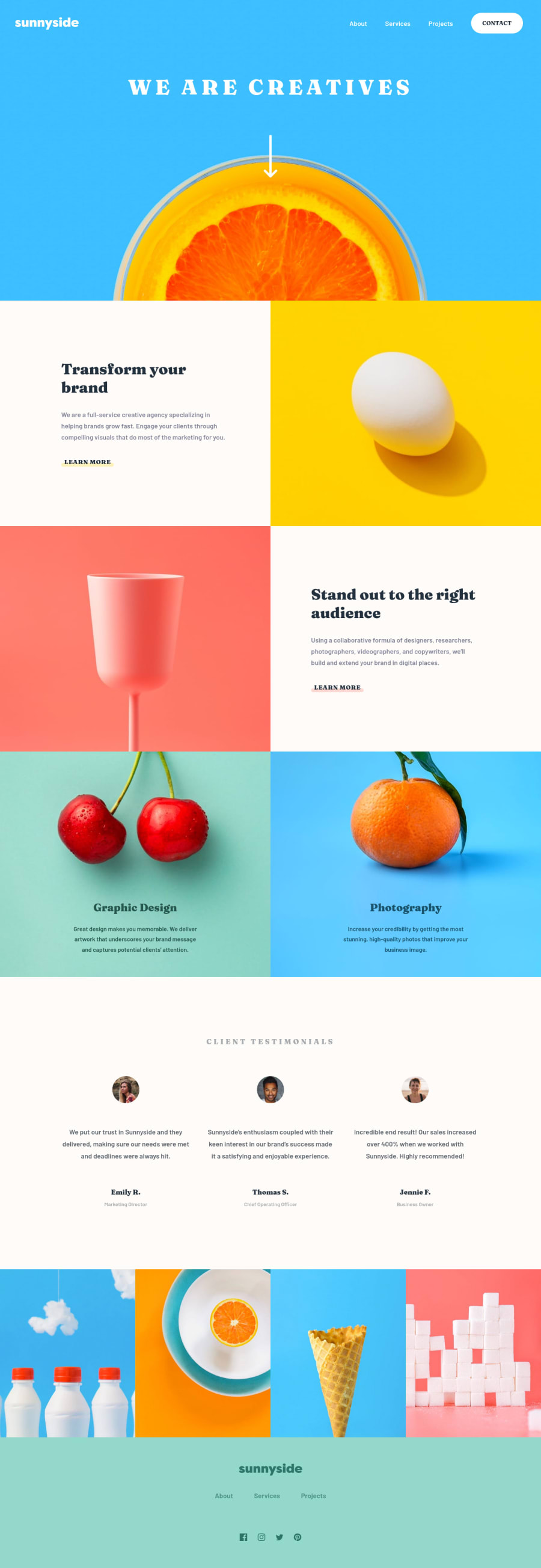
My first landing page, I really tried to make it very very close to the design in both desktop and mobile view, I think I did well. Tried Figma for the first time, just used the free jpegs inside it, and it went like a breeze! It's so much easier to measure all the stuff there than in Krita(which I used previously).
Questions:
- What are the best practices of making a burger button and a menu? I think the method I used is fine, but maybe there are others?
- I made the tip of the mobile menu and links' bold underlines with
::beforecss alchemy. Maybe there are better ways? - For widths between 375px and 1440px I used my judgements about how the design should respond, does it feel good?
- I also set
max-widthof the whole page to 1700px, not sure, maybe should've set wider?
I'd also appreciate any feedback on html and css, I spent a bunch of time on this simple project and not sure whether it turned good or not, maybe I should've gone for simpler approach with fewer @media queries?
Community feedback
Please log in to post a comment
Log in with GitHub
Join our Discord community
Join thousands of Frontend Mentor community members taking the challenges, sharing resources, helping each other, and chatting about all things front-end!
Join our Discord